Evan Frazier, CFA, CAIA
Senior Research Analyst


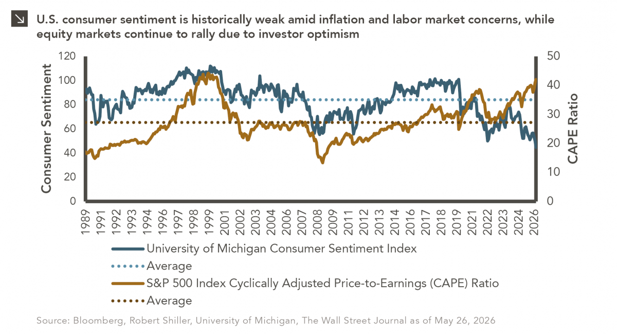
The classic novel A Tale of Two Cities by Charles Dickens begins with the line “It was the best of times, it was the worst of times…” While Dickens was describing the extreme contradictions of the late 18th century leading up to the French Revolution (i.e., comfort for the aristocracy and hardship for the poor), this line could just as easily apply to the current economic environment in the United States, which is marked by a stark divergence between consumer confidence and investor behavior. Specifically, recent University of Michigan consumer sentiment readings have fallen to some of the weakest levels in decades, reflecting persistent frustration on the part of many Americans over inflation, elevated interest rates, high gasoline prices, and job security. Consumers remain particularly sensitive to the cumulative impact of several years of higher prices, even as headline inflation has moderated from its post-pandemic peaks. Surveys from both the University of Michigan and the Conference Board suggest U.S. households are increasingly worried about future economic conditions and weakness in the labor market. At the same time, equity markets have largely shaken off these concerns given enthusiasm surrounding artificial intelligence and expectations for longer-term productivity gains. Indeed, the S&P 500 Index has notched gains of more than 17% in each of the last three full calendar years and has advanced more than 9% in 2026 as of this writing. This strong performance has led to higher equity market valuations. As can be seen in this week’s chart, the Shiller Cyclically Adjusted Price-to-Earnings (CAPE) Ratio for the S&P 500 Index, which compares prices to average inflation-adjusted earnings over the prior 10 years to smooth out short-term volatility, sits at roughly 42. This figure is well above historical average levels and signals that investors continue to pay a significant premium for future earnings growth despite weaker consumer sentiment. Many have described this dynamic as a “tale of two markets,” as investors reward companies with outsized earnings potential and the ability to generate technological disruption even as households cut back on discretionary spending and grow more cautious about the economy.
A major driver of the divergence described above is the way in which financial asset ownership is distributed in the United States. A recent estimate from the Federal Reserve indicates that the top 10% of American households own roughly 90% of all U.S. corporate equities and mutual fund shares, meaning recent market gains have created a wealth effect that continues to support spending among affluent consumers, even as lower- and middle-income households face significant pressures. This divergence also highlights the forward-looking nature of financial markets, as equity investors are often pricing in anticipated earnings growth and future monetary policy as opposed to current economic conditions. Most consumers, on the other hand, respond more directly to present-day realities such as grocery bills, gasoline prices, and the perceived stability of the labor market. Whether this sentiment gap ultimately closes due to consumer confidence that is recalled to life or equity valuations that face the guillotine of market repricing remains one of the key questions facing investors in the near term.
Print PDF
The opinions expressed herein are those of Marquette Associates, Inc. (“Marquette”), and are subject to change without notice. This material is not financial advice or an offer to purchase or sell any product. Marquette reserves the right to modify its current investment strategies and techniques based on changing market dynamics or client needs.

10.12.2026
This week’s chart highlights the accelerating growth of electricity demand in the U.S., which has been driven primarily by the…

10.08.2026
LIVE WEBINAR — OCTOBER 22 Please join Marquette’s research team for our 3Q 2026 Market Insights Webinar…

10.05.2026
For investors, the spookiest thing about October might not be the ghosts and monsters that are bound to show up…

09.28.2026
The phrase “expectations of higher inflation” has become a staple in financial news to explain the increase in nominal U.S….

09.21.2026
For much of the past several years, the conventional view has been that higher interest rates and stretched valuations would…

09.14.2026
There are many great things about working at Marquette Associates, but “Free Lunch Tuesday” is right at the top of…
Research alerts keep you updated on our latest research publications. Simply enter your contact information, choose the research alerts you would like to receive and click Subscribe. Alerts will be sent as research is published.
We respect your privacy. We will never share or sell your information.
If you have questions or need further information, please contact us directly and we will respond to your inquiry within 24 hours.
Contact Us >