David Hernandez, CFA
Director of Traditional Manager Search
A growing population of socially conscious investors has energized socially responsible investment (SRI) strategies in the past decade. The Forum for Sustainable and Responsible Investment defines SRI as the process of integrating personal values and societal concerns into investment decision making. SRI has increased in the U.S. from $639 million in 1995 to $6.6 trillion in 2014. These assets account for roughly 17% of total dollars under management in the U.S.
This newsletter outlines a brief history of SRI, approaches to implementing an SRI program including positive and negative screening and shareholder activism; impact investing; example products and solutions in equities, fixed income, and real estate; investor concerns around performance and fiduciary liability, and considerations for implementing a sustainable investing program.

The opinions expressed herein are those of Marquette Associates, Inc. (“Marquette”), and are subject to change without notice. This material is not financial advice or an offer to purchase or sell any product. Marquette reserves the right to modify its current investment strategies and techniques based on changing market dynamics or client needs.

07.07.2026
JULY 23 — 1:00pm CT Please join Marquette’s research team for our 2026 Halftime Market Insights Webinar…

06.29.2026
This week’s chart highlights the varying return profiles across key infrastructure sectors by illustrating the split between income and capital…
06.25.2026
Commodities represent a unique asset class within global financial markets. Like equities and bonds, commodity prices are influenced by the…

06.15.2026
The rapid buildout of artificial intelligence infrastructure is reshaping the U.S. investment landscape. According to recent Census Bureau data, spending…
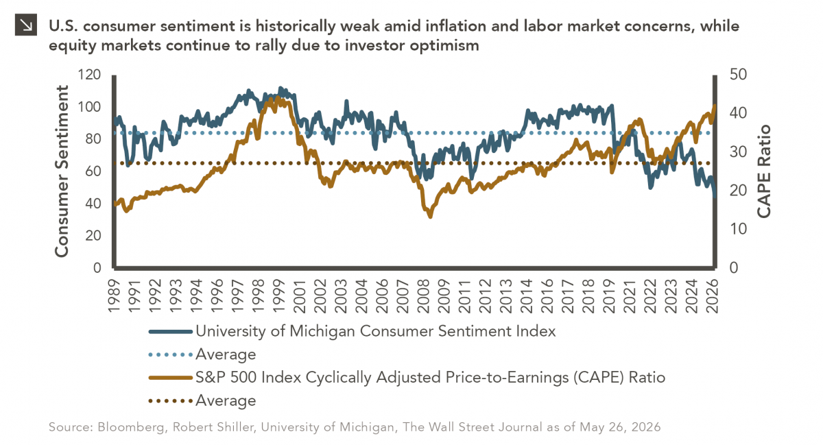
05.26.2026
The classic novel A Tale of Two Cities by Charles Dickens begins with the line “It was the best of…
05.18.2026
Over the last few years, equity markets have been defined by a group of stocks often referred to as the…
Research alerts keep you updated on our latest research publications. Simply enter your contact information, choose the research alerts you would like to receive and click Subscribe. Alerts will be sent as research is published.
We respect your privacy. We will never share or sell your information.
If you have questions or need further information, please contact us directly and we will respond to your inquiry within 24 hours.
Contact Us >