Thomas Neuhardt
Associate Research Analyst
Get to Know Thomas


With the first Federal Reserve rate cut of the current loosening cycle in the rear-view mirror, investors are now questioning how markets will react to a new era of macroeconomic policy. While each rate cycle is unique, examining how the S&P 500 and Bloomberg Aggregate indices have responded to prior instances of rate cuts can give investors some insight on what to expect going forward. To that point, this week’s chart highlights the returns of these benchmarks following the first cut of last six periods of easing by the Federal Reserve. Although rate cuts have historically portended higher near-term equity returns, there have been two instances of negative S&P 500 Index performance in the wake of Fed easing. Specifically, the 1- and 3-year returns following rate cuts in 2001 (the Dot Com Bubble) and 2007 (the Global Financial Crisis) were both negative. That said, performance of the Bloomberg U.S. Aggregate Bond Index was positive during both of those periods, as well as during the other four easing cycles shown in this week’s chart. Even during the 3-year period following July of 2019, which included six months of rate hikes in 2022, the fixed income benchmark returned 0.4% on an annualized basis. In summary, although Fed rate cuts have historically coincided with recessions in the U.S., investors can gain comfort from that fact that both equities and bonds have fared relatively well amid periods of monetary policy loosening.
Print PDF
The opinions expressed herein are those of Marquette Associates, Inc. (“Marquette”), and are subject to change without notice. This material is not financial advice or an offer to purchase or sell any product. Marquette reserves the right to modify its current investment strategies and techniques based on changing market dynamics or client needs.

10.12.2026
This week’s chart highlights the accelerating growth of electricity demand in the U.S., which has been driven primarily by the…

10.05.2026
For investors, the spookiest thing about October might not be the ghosts and monsters that are bound to show up…

09.28.2026
The phrase “expectations of higher inflation” has become a staple in financial news to explain the increase in nominal U.S….

09.21.2026
For much of the past several years, the conventional view has been that higher interest rates and stretched valuations would…

09.14.2026
There are many great things about working at Marquette Associates, but “Free Lunch Tuesday” is right at the top of…
09.08.2026
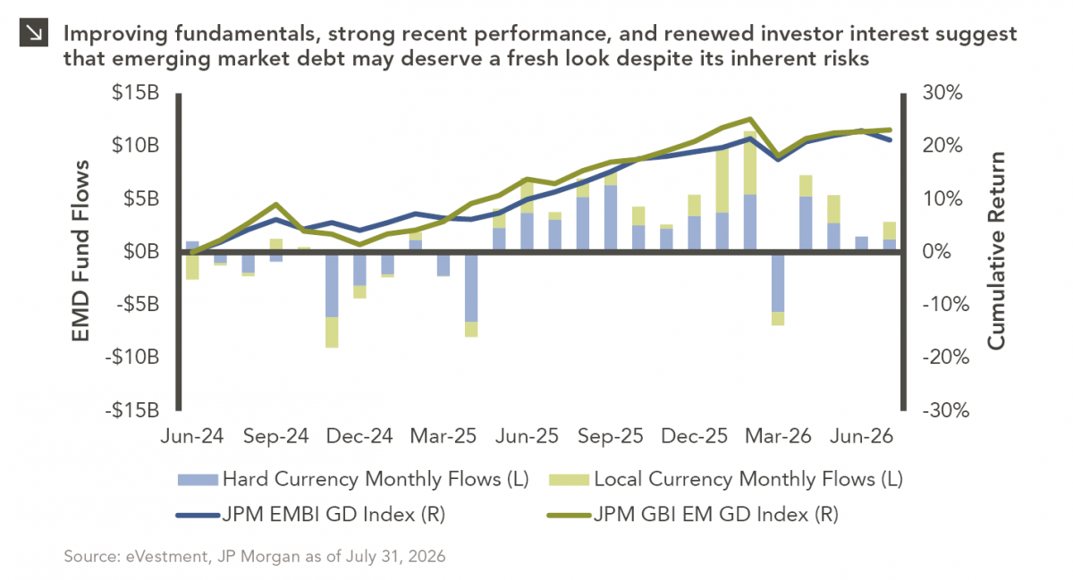
Over the last several years, emerging market debt (EMD) has faced several headwinds, with rising yields across other fixed income…
Research alerts keep you updated on our latest research publications. Simply enter your contact information, choose the research alerts you would like to receive and click Subscribe. Alerts will be sent as research is published.
We respect your privacy. We will never share or sell your information.
If you have questions or need further information, please contact us directly and we will respond to your inquiry within 24 hours.
Contact Us >