Thomas Neuhardt
Associate Research Analyst
Get to Know Thomas


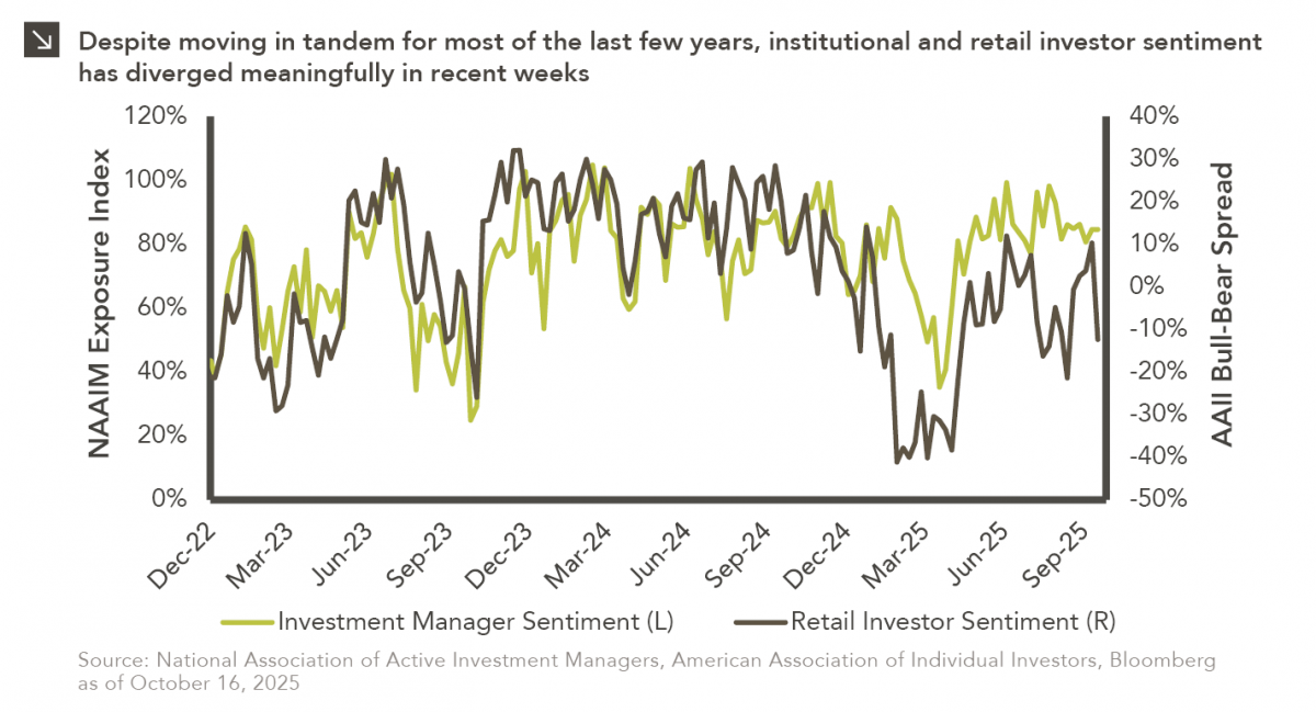
This week’s chart compares institutional and retail investor sentiment using two established indicators. Institutional sentiment is represented by the National Association of Active Investment Managers (NAAIM) Exposure Index, which measures the average U.S. equity market exposure reported by NAAIM member firms (i.e., organizations that actively manage client portfolios). Reported exposures for this index include -200% (leveraged short) to -100% (fully short), 0% (market neutral), +100% (fully invested), and +200% (leveraged long), capturing the breadth of positioning from extremely bearish to highly bullish. Retail sentiment is represented by the American Association of Individual Investors (AAII) Sentiment Survey, which reflects the bullish-minus-bearish spread regarding the six-month outlook for stocks across individual AAII members (i.e., retail investors). When analyzed together, these indicators offer perspective on how both institutional and individual investors view the near-term prospects of equity markets.
Readers will note that these two indices have moved in tandem throughout most of the last several years but have diverged significantly in recent weeks as retail investor sentiment has plunged. It is not entirely clear what’s driving this latest divergence, but several factors likely play a role. Specifically, renewed U.S.–China trade tensions, the ongoing federal government shutdown, and interest rate uncertainty have likely weighed more heavily on retail investors, who tend to be more influenced by headline noise. Institutional money managers, on the other hand, appear to be maintaining confidence in healthy corporate fundamentals and the broader economic backdrop. Regardless of its exact cause, this divergence underscores the notion that sentiment data should be viewed as context-dependent rather than as a market timing signal.
Print PDF
The opinions expressed herein are those of Marquette Associates, Inc. (“Marquette”), and are subject to change without notice. This material is not financial advice or an offer to purchase or sell any product. Marquette reserves the right to modify its current investment strategies and techniques based on changing market dynamics or client needs.

10.12.2026
This week’s chart highlights the accelerating growth of electricity demand in the U.S., which has been driven primarily by the…

10.08.2026
LIVE WEBINAR — OCTOBER 22 Please join Marquette’s research team for our 3Q 2026 Market Insights Webinar…

10.05.2026
For investors, the spookiest thing about October might not be the ghosts and monsters that are bound to show up…

09.28.2026
The phrase “expectations of higher inflation” has become a staple in financial news to explain the increase in nominal U.S….

09.21.2026
For much of the past several years, the conventional view has been that higher interest rates and stretched valuations would…

09.14.2026
There are many great things about working at Marquette Associates, but “Free Lunch Tuesday” is right at the top of…
Research alerts keep you updated on our latest research publications. Simply enter your contact information, choose the research alerts you would like to receive and click Subscribe. Alerts will be sent as research is published.
We respect your privacy. We will never share or sell your information.
If you have questions or need further information, please contact us directly and we will respond to your inquiry within 24 hours.
Contact Us >