10.08.2026
3Q 2026 Market Insights
This video is a recording of a live webinar held October 22 by Marquette’s research team analyzing the third quarter…


The pullback in global equity indices at the beginning of August left many investors racing to understand what had caused such outsized volatility. Amid this market turbulence, there were two seemingly unrelated economic events that occurred on different sides of the globe. On July 31, the Bank of Japan surprisingly announced that it would raise its benchmark interest rate from 0.10% to 0.25%, continuing its transition from the ultra-low rates that had been commonplace in recent time. Later that week, the July U.S. nonfarm payroll employment data, which many use to gauge the health of the domestic labor market, came in below estimates. This report led investors to question the strength of the U.S. economy and whether the Federal Reserve had waited too long to cut its policy rate. Simply put, equity markets reacted negatively. The Nasdaq, which is a growth-oriented U.S. large-cap stock index, exhibited a particularly sharp drop during this time, falling by roughly 7% in less than one week. The speed and severity of this sell-off left many asking if one poor labor report alone was solely to blame. As it turned out, the Bank of Japan’s interest rate decision earlier in the week may have been just as important as it relates to what had occurred in U.S. markets.
A “carry trade” is a strategy wherein an investor borrows in a low-yielding currency (in this case the Japanese yen) and invests the borrowed funds in a higher-yielding asset. While it is difficult to assess the size and scope of these trades, certain statistical relationships can emerge that may shine light on how borrowed funds are being invested. To that point, the chart above shows the year-to-date changes in level of the Nasdaq index and the value of the U.S. dollar (USD) relative to the Japanese yen (JPY). Interestingly, on a rolling 30-day basis since the start of the year, the movements of the NASDAQ and USD/JPY have been moderately correlated with a coefficient of 0.46 (a coefficient of 1 would indicate a perfectly positively correlated relationship). While indeed moderate, this relationship does indicate that as the dollar has weakened relative to the yen, the Nasdaq has weakened in a similar fashion. What might be driving this relationship?
While we cannot draw definitive conclusions based on correlation alone, the carry trade strategy may be partially responsible for the emergence of this relationship. In the first half of this year, U.S. large-cap stocks notched strong performance while the dollar steadily strengthened against the yen, which kept yen borrowing costs low. That said, when the Bank of Japan raised its policy rate (and the cost of borrowing yen) in late July, many carry trade investors were forced to sell assets to pay back the funds borrowed in yen, which was now rapidly appreciating against the dollar. For those who had been investing borrowed funds in U.S. stocks, harvesting gains from these positions would be a logical move in order to post collateral. It is important to point out, however, that this process can snowball. Specifically, higher demand for yen drives up the value of the currency, which prompts collateral calls for more investors who have borrowed in yen, which leads to further selling of risk assets like U.S. stocks. This feedback loop can be observed in the shaded region of this week’s chart, during which the correlation coefficient between Nasdaq and USD/JPY jumped to more than 0.9.
While this chart highlights one relationship to provide insight into the recent spike in equity volatility, a broader conclusion readers should draw is that changing dynamics within global markets and the opaque nature of certain trades can make risks faced by investors difficult to identify and measure. As a result, it is important for investors to maintain well-diversified portfolios that can weather various market environments.
Print PDFThe opinions expressed herein are those of Marquette Associates, Inc. (“Marquette”), and are subject to change without notice. This material is not financial advice or an offer to purchase or sell any product. Marquette reserves the right to modify its current investment strategies and techniques based on changing market dynamics or client needs.

10.08.2026
This video is a recording of a live webinar held October 22 by Marquette’s research team analyzing the third quarter…

10.22.2026
Anyone who has run a marathon knows the last six miles are brutal — no matter how well the first…
10.19.2026
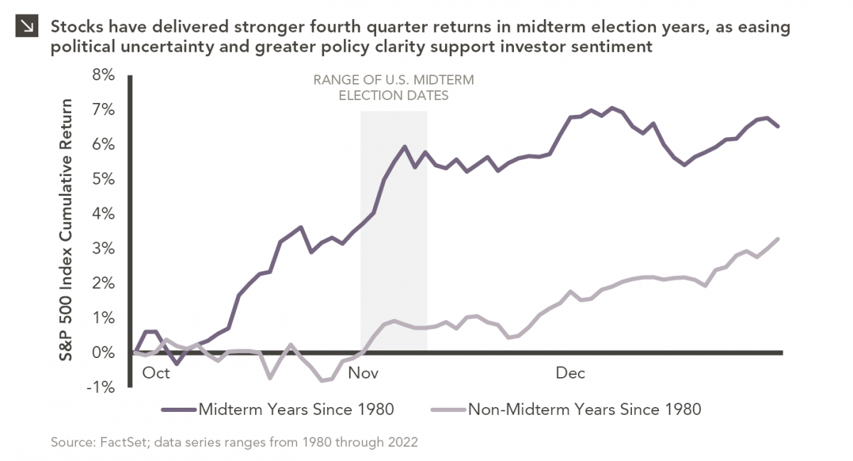
Since 1980, the S&P 500 Index has generally performed well in the weeks surrounding U.S. midterm elections. Specifically, the index…

10.12.2026
This week’s chart highlights the accelerating growth of electricity demand in the U.S., which has been driven primarily by the…

10.05.2026
For investors, the spookiest thing about October might not be the ghosts and monsters that are bound to show up…

09.28.2026
The phrase “expectations of higher inflation” has become a staple in financial news to explain the increase in nominal U.S….
Research alerts keep you updated on our latest research publications. Simply enter your contact information, choose the research alerts you would like to receive and click Subscribe. Alerts will be sent as research is published.
We respect your privacy. We will never share or sell your information.
If you have questions or need further information, please contact us directly and we will respond to your inquiry within 24 hours.
Contact Us >