Midterm Madness

September 22, 2022 | Thomas Neuhardt, Associate Research Analyst

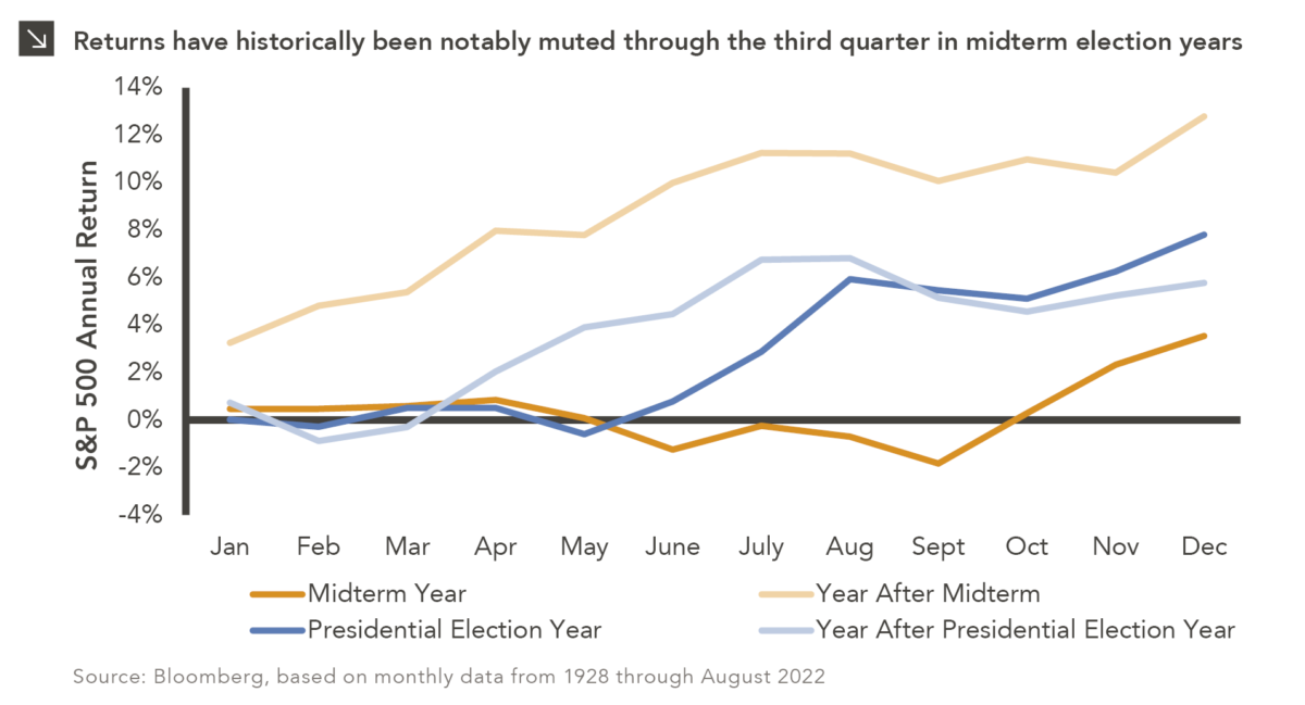
If inflation, rising rates, and a war in Europe were not enough to keep markets interesting this year, 2022 is also a midterm election year. Based on data over the last nine decades, midterm election years — while only marginally more volatile than non-election years overall — tend to exhibit a distinct performance pattern throughout the year. On average, returns during midterm years tend to be flat to slightly negative through the first three quarters as investor confidence is dampened by uncertainty around the outcome of the election. Historically, returns start to pick up as November draws near and tend to finish strongly, with fourth quarter returns in midterm years significantly stronger than non-midterm years. This holds true regardless of which party wins the House and Senate and whether or not there is a change of control, suggesting investors value predictability more so than a specific party controlling Congress. While each year is unique, and this analysis does not consider the deluge of other macroeconomics issues plaguing 2022, it is interesting historical context. Come November 6, there may be one less source of uncertainty in markets.

Print PDF > Midterm Madness


The opinions expressed herein are those of Marquette Associates, Inc. (“Marquette”), and are subject to change without notice. This material is not financial advice or an offer to purchase or sell any product. Marquette reserves the right to modify its current investment strategies and techniques based on changing market dynamics or client needs.

Thomas Neuhardt
Associate Research Analyst

Get to Know Thomas

The opinions expressed herein are those of Marquette Associates, Inc. (“Marquette”), and are subject to change without notice. This material is not financial advice or an offer to purchase or sell any product. Marquette reserves the right to modify its current investment strategies and techniques based on changing market dynamics or client needs.

Related Content

Chart #1 - Line chart showing PJM summer peak load estimates in gigawatts (GW) from 2015 to 2045. The chart compares historical peak load, current capacity, and forecasts from 2024, 2025, and 2026, showing projected demand rising above current capacity over time. Chart #2 - Stacked bar chart showing U.S. power demand in terawatt-hours (TWh) for 2025 and estimated demand in 2030. The chart compares data center and non-data center demand, showing total power demand increasing over the period.

10.12.2026

The Power Demand Supercycle

This week’s chart highlights the accelerating growth of electricity demand in the U.S., which has been driven primarily by the…

10.08.2026

3Q 2026 Market Insights Webinar

LIVE WEBINAR — OCTOBER 22 Please join Marquette’s research team for our 3Q 2026 Market Insights Webinar…

Bar chart showing average monthly VIX levels from 1990 through October 2026. The x-axis displays months of the year from January through December, and the y-axis displays VIX level. October has the highest average VIX level among all months, while April has the lowest. The chart also includes a current VIX level and a long-term average VIX level for comparison. Source: Bloomberg as of October 2, 2026. Data series begins in 1990. For full dataset, please contact marquettemarketing@marquetteassociates.com.

10.05.2026

Spooky Season

For investors, the spookiest thing about October might not be the ghosts and monsters that are bound to show up…

Line chart showing 10-year U.S. Treasury rate, 5-year/5-year breakeven inflation rate, and 10-year real yield from December 2025 through September 2026. The left axis shows rates from 3.6% to 5.4%, and the right axis from 1.6% to 3.0%. The Treasury rate and real yield rise notably in late 2026, while the breakeven inflation rate remains relatively range-bound around 2.3%–2.4%. For full dataset, please contact marquettemarketing@marquetteassociates.com.

09.28.2026

Getting Real on Inflation

The phrase “expectations of higher inflation” has become a staple in financial news to explain the increase in nominal U.S….

Dual-axis line chart comparing LBO/M&A/Recapitalization Activity, its average level, and the SOFR (90-Day) rate from 3Q18 through 2Q26. LBO/M&A/Recapitalization Activity ranges from approximately $0 billion to $100 billion, while SOFR ranges from 0% to approximately 5%. For full dataset, please contact marquettemarketing@marquetteassociates.com.

09.21.2026

Let’s Make a Deal

For much of the past several years, the conventional view has been that higher interest rates and stretched valuations would…

Line chart comparing annualized return and annualized risk for stock-bond portfolio combinations from 1976-2019 and 2020-2026. Two lines show the range of return and risk outcomes across portfolio allocations during each period. For full dataset, please contact marquettemarketing@marquetteassociates.com.

09.14.2026

No More Free Lunch?

There are many great things about working at Marquette Associates, but “Free Lunch Tuesday” is right at the top of…

More articles

Subscribe to Research Email Alerts

Research Email Alert Subscription

Research alerts keep you updated on our latest research publications. Simply enter your contact information, choose the research alerts you would like to receive and click Subscribe. Alerts will be sent as research is published.

We respect your privacy. We will never share or sell your information.

Thank You

We appreciate your interest in Marquette Associates.

If you have questions or need further information, please contact us directly and we will respond to your inquiry within 24 hours.

Contact Us >