09.08.2026
EMD’s Second Chance?
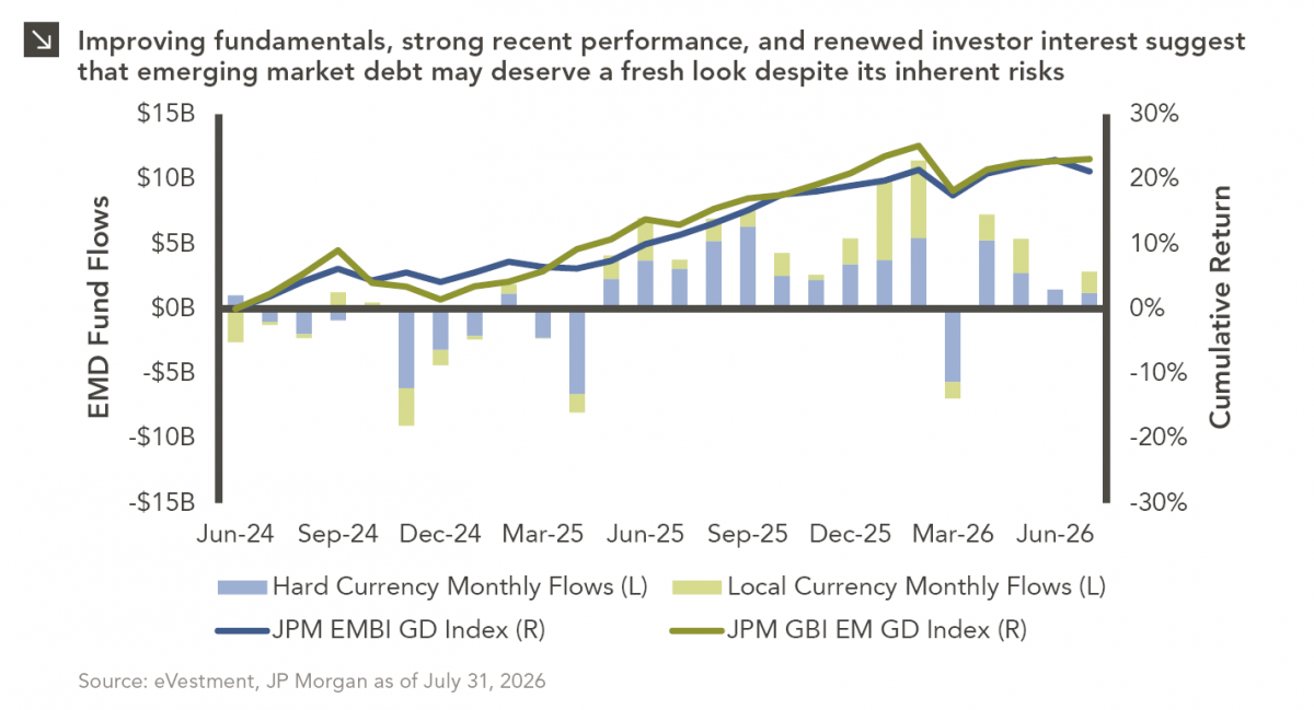
Over the last several years, emerging market debt (EMD) has faced several headwinds, with rising yields across other fixed income…


The U.S. Treasury yield curve is flatter today than it was at the end of the Great Recession in 2009. This week’s chart examines how flat the curve is now, and the potential for further flattening, possible inversion, or potential steepening. The 10s minus 2s steepness shown in the chart is the 2-year Treasury yield subtracted from the 10-year Treasury yield.
In general, a steep yield curve signifies a growing economy and a bullish market, as long-term bonds must provide greater yields to keep up with future growth. On the other hand, an inverted yield curve signifies a shrinking economy and a bearish market, as investors buy long-term bonds as safe havens, thereby driving their prices up and lowering their yields. As we can see from the chart, the yield curve inverted prior to the 2000 tech bubble burst and prior to the 2008 Great Recession.
With the Tax Cut now signed and underway, we would theoretically expect the yield curve to steepen as the market expects stronger economic growth. However, in the fourth quarter of 2017 — as the legislation gained momentum through Congress and was ultimately signed into law by Trump — the yield curve flattened instead. This is a possible sign that much of the tax stimulus may have already been priced into assets.
Previous Fed Chairs Greenspan and Bernanke both said the economy would be fine after the yield curve inverted in 2000 and 2008, respectively. Going forward, we may expect that the new Fed Chair Jerome Powell will be more cautious in preventing inversion.
Prospects for curve steepening still exist, as inflation — which rose recently — may continue to rise as the economy benefits from the Tax Cut. Rising inflation would then be expected to raise the long end of the yield curve. However, we continue to see the mitigating effect of overseas reach for yield, as U.S. rates across the curve still outyield rates from the rest of the developed markets. Non-U.S. pensions, insurers, and banks continuing to buy long U.S. bonds may drive up prices and keep yields low on that segment of the curve.
Given the flat yield curve, we recommend maintaining an allocation to core bonds for yield, diversification, and principal protection, as well as the inherent moderate duration position.
The opinions expressed herein are those of Marquette Associates, Inc. (“Marquette”), and are subject to change without notice. This material is not financial advice or an offer to purchase or sell any product. Marquette reserves the right to modify its current investment strategies and techniques based on changing market dynamics or client needs.
The opinions expressed herein are those of Marquette Associates, Inc. (“Marquette”), and are subject to change without notice. This material is not financial advice or an offer to purchase or sell any product. Marquette reserves the right to modify its current investment strategies and techniques based on changing market dynamics or client needs.
09.08.2026
Over the last several years, emerging market debt (EMD) has faced several headwinds, with rising yields across other fixed income…
08.31.2026
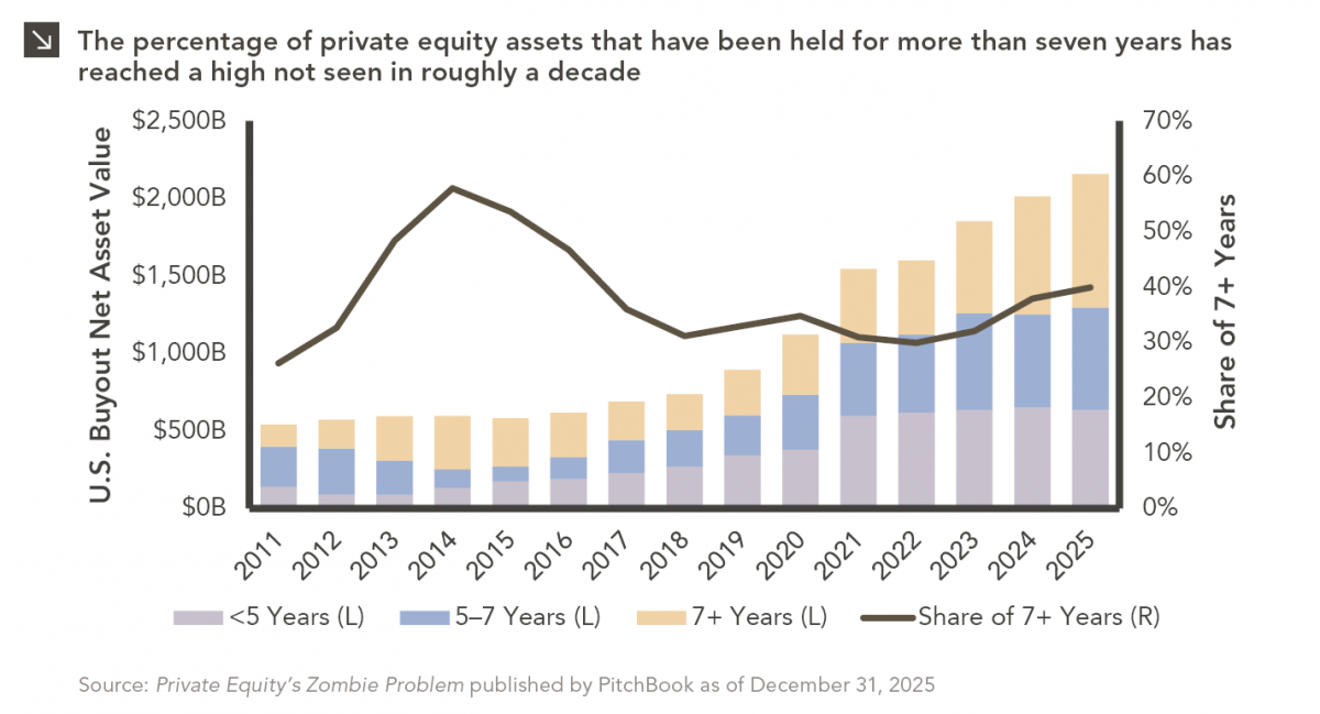
Private equity has always had a few portfolio companies that refused to leave the party. Today, however, the industry appears…
08.24.2026
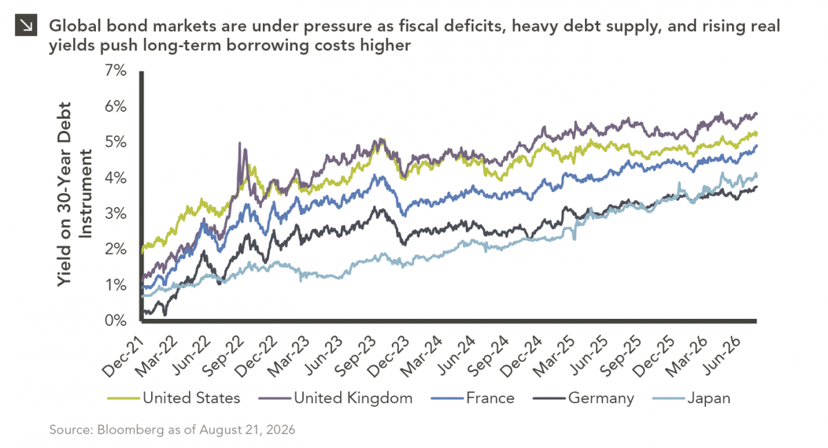
The global bond market is facing renewed pressure as investors demand higher yields to hold long-dated government debt, pushing borrowing…

08.17.2026
As a college football player struggling to put on mass, the “supersizing” deal at McDonald’s was hard to beat. For…
08.10.2026
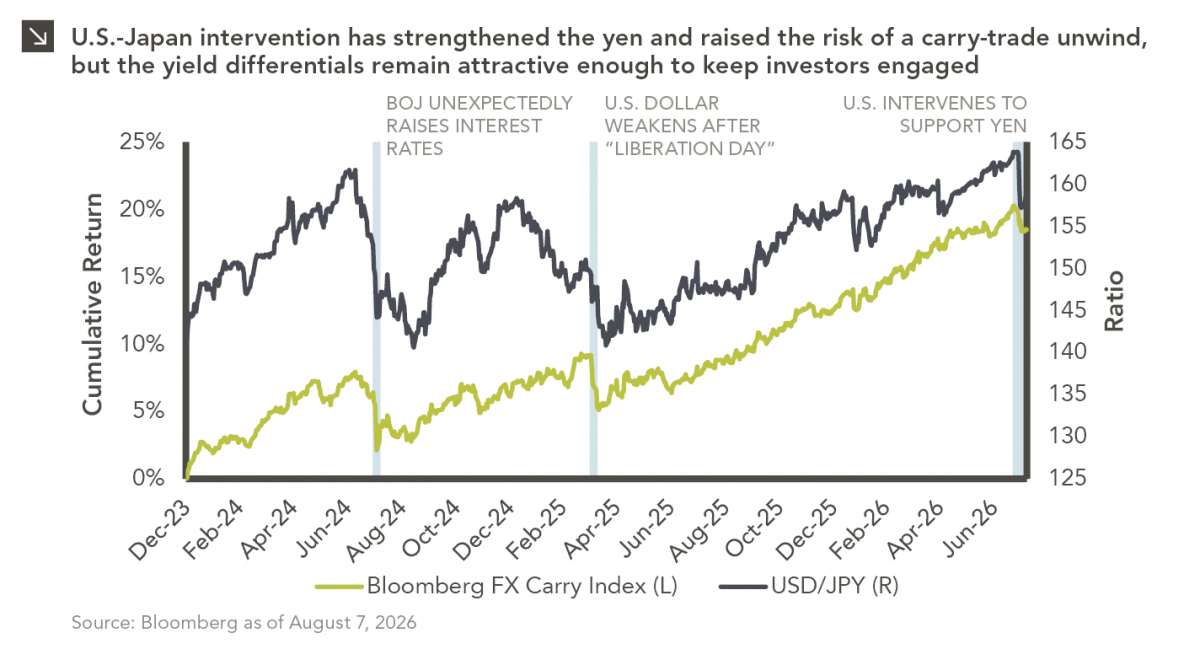
After reaching nearly ¥164 per dollar, its weakest level in roughly four decades, the yen had become a source of…
08.03.2026
In the cinematic masterpiece Rocky IV, Rocky gets dazed by his opponent, Captain Ivan Drago, and complains that he sees…
Research alerts keep you updated on our latest research publications. Simply enter your contact information, choose the research alerts you would like to receive and click Subscribe. Alerts will be sent as research is published.
We respect your privacy. We will never share or sell your information.
If you have questions or need further information, please contact us directly and we will respond to your inquiry within 24 hours.
Contact Us >