09.08.2026
EMD’s Second Chance?
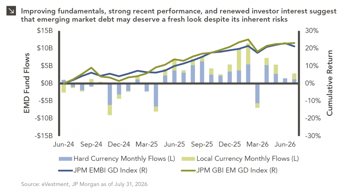
Over the last several years, emerging market debt (EMD) has faced several headwinds, with rising yields across other fixed income…


The unemployment situation in the U.S. has been a major concern for economists when considering an economic recovery from the “Great Recession”. This week’s chart examines the peak employment level (total number of people working in the U.S. labor force), along with the time taken to return to that peak level after a recession. The chart looks at peak employment in percentage terms, so 100% indicates the U.S. is at a peak employment level, while anything below 100% indicates the employment level is lower than the previous peak employment.
The U.S. hit a peak employment level in November 2007, and has yet to make much progress towards reaching that peak again. Since 1948, this is the longest time period the peak employment level has remained under its previous high after a recession. Growth in the U.S. labor force (total number of people working or seeking work) has leveled off over the last few years while more than 1.7 million civilians have dropped out of the labor force since mid-2008. The nearly 14 million unemployed people that remain in the labor force average nearly 37 weeks of being unemployed.
Several economists, including those that authored a working paper at the San Francisco Fed, have noted that the natural unemployment rate, long considered to be 5%, may have increased over the last several years to stand as high as 6.9% today. After examining variables such as labor market skill mismatches, extended unemployment benefits and growth in productivity, these studies have concluded that the increase in the natural rate of unemployment is most likely temporary, though may last for several years.
The opinions expressed herein are those of Marquette Associates, Inc. (“Marquette”), and are subject to change without notice. This material is not financial advice or an offer to purchase or sell any product. Marquette reserves the right to modify its current investment strategies and techniques based on changing market dynamics or client needs.
09.08.2026
Over the last several years, emerging market debt (EMD) has faced several headwinds, with rising yields across other fixed income…
08.31.2026
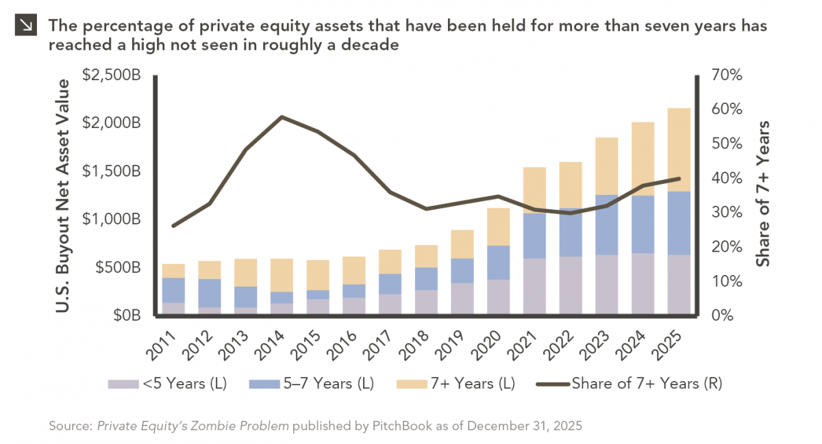
Private equity has always had a few portfolio companies that refused to leave the party. Today, however, the industry appears…
08.24.2026
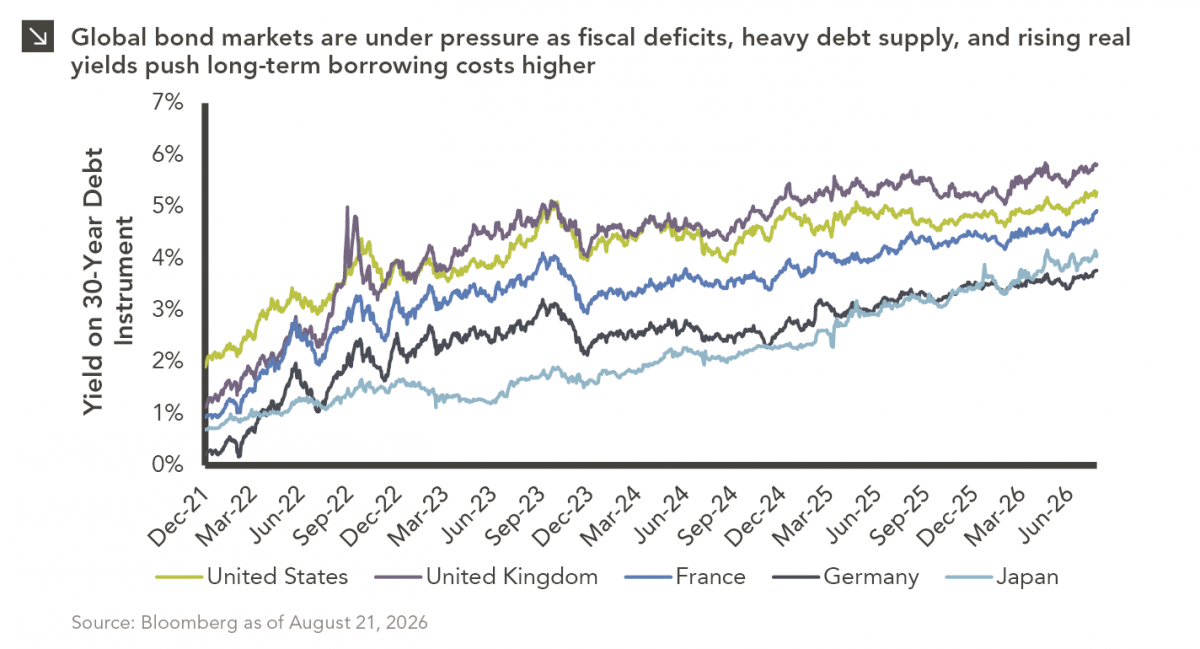
The global bond market is facing renewed pressure as investors demand higher yields to hold long-dated government debt, pushing borrowing…
08.17.2026
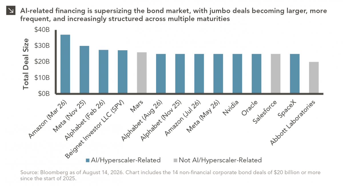
As a college football player struggling to put on mass, the “supersizing” deal at McDonald’s was hard to beat. For…
08.10.2026
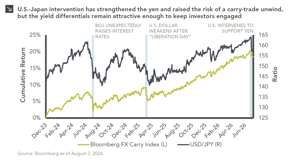
After reaching nearly ¥164 per dollar, its weakest level in roughly four decades, the yen had become a source of…
08.03.2026
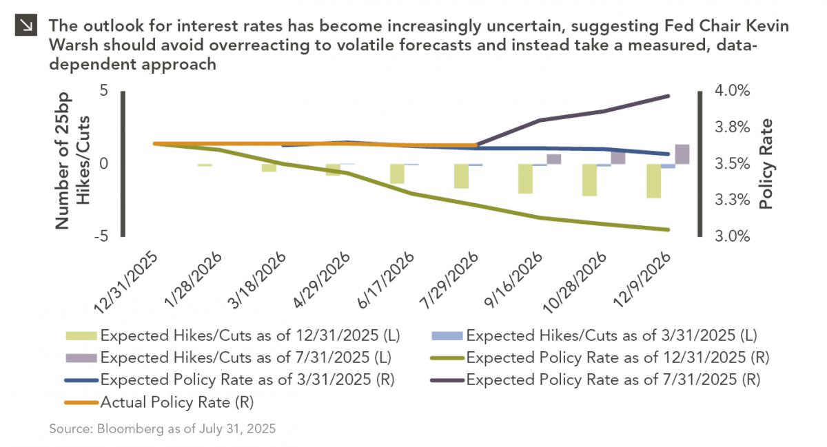
In the cinematic masterpiece Rocky IV, Rocky gets dazed by his opponent, Captain Ivan Drago, and complains that he sees…
Research alerts keep you updated on our latest research publications. Simply enter your contact information, choose the research alerts you would like to receive and click Subscribe. Alerts will be sent as research is published.
We respect your privacy. We will never share or sell your information.
If you have questions or need further information, please contact us directly and we will respond to your inquiry within 24 hours.
Contact Us >