10.08.2026
3Q 2026 Market Insights
This video is a recording of a live webinar held October 22 by Marquette’s research team analyzing the third quarter…


Most investors are familiar with the PE ratio as a metric of valuation. This metric divides the current stock price by trailing twelve month earnings. In effect, it measures how much an investor pays compared to the amount of earnings a company or index provides. As a measure of valuation, PE can be heavily influenced by the cyclical nature of earnings. To smooth out fluctuations due to cyclicality, one approach, popularized by Robert Shiller, is to divide equity index prices by ten-year average earnings. The measure, known as the Cyclically Adjusted PE (CAPE), can provide an indication of when markets are exceptionally over or undervalued.
This week’s Chart of the Week shows CAPEs for market stock indices of 47 countries including the United States. The U.S. comes in at the middle of the pack, with a CAPE of 19.6. This is much higher than the trailing 12-month PE of 13-14, due to the large declines in earnings suffered over the last ten years. Perhaps unsurprisingly, the countries with the lowest CAPEs reside in peripheral Europe. Greece, with a CAPE of 3.0, looks extremely undervalued by this measure. Spain and Italy, which are both home to large multinational corporations, have CAPEs just below 10. The Netherlands, which is a net lender in the Eurozone, has a CAPE below 10.
Of course, while low valuations have tended to precede strong long-term performance, this is by no means guaranteed. Additionally, given the ongoing nature of the Eurozone crisis, short-term performance of European equity markets is likely to be choppy at best. The Athens Stock Index, for example, is down 49% over the last year alone. Still, on a relative valuation basis, European equity markets look attractive compared to other countries for long-term investors.
The opinions expressed herein are those of Marquette Associates, Inc. (“Marquette”), and are subject to change without notice. This material is not financial advice or an offer to purchase or sell any product. Marquette reserves the right to modify its current investment strategies and techniques based on changing market dynamics or client needs.

10.08.2026
This video is a recording of a live webinar held October 22 by Marquette’s research team analyzing the third quarter…

10.22.2026
Anyone who has run a marathon knows the last six miles are brutal — no matter how well the first…
10.19.2026
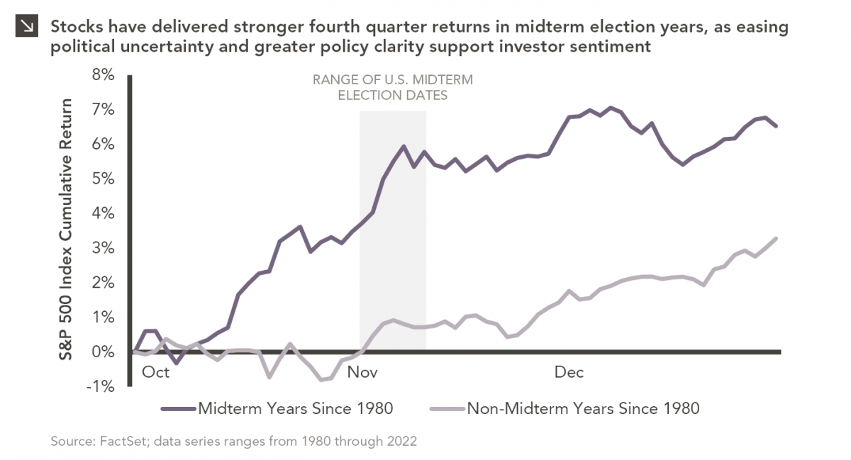
Since 1980, the S&P 500 Index has generally performed well in the weeks surrounding U.S. midterm elections. Specifically, the index…
10.12.2026
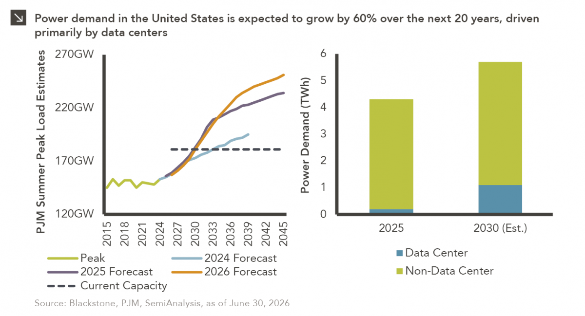
This week’s chart highlights the accelerating growth of electricity demand in the U.S., which has been driven primarily by the…
10.05.2026
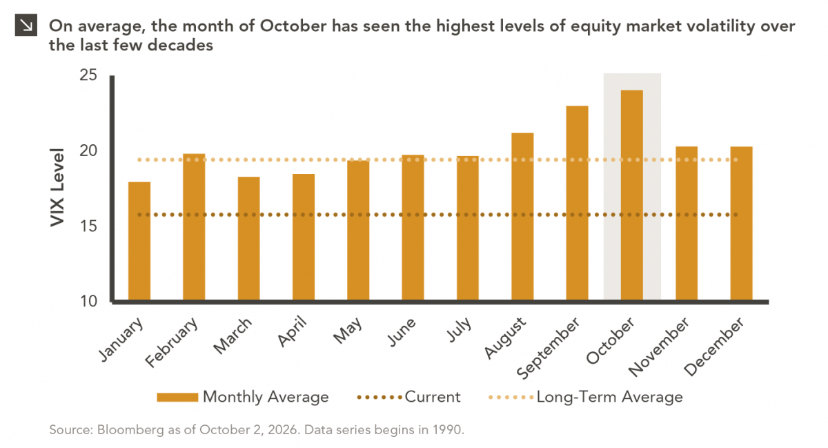
For investors, the spookiest thing about October might not be the ghosts and monsters that are bound to show up…
09.28.2026
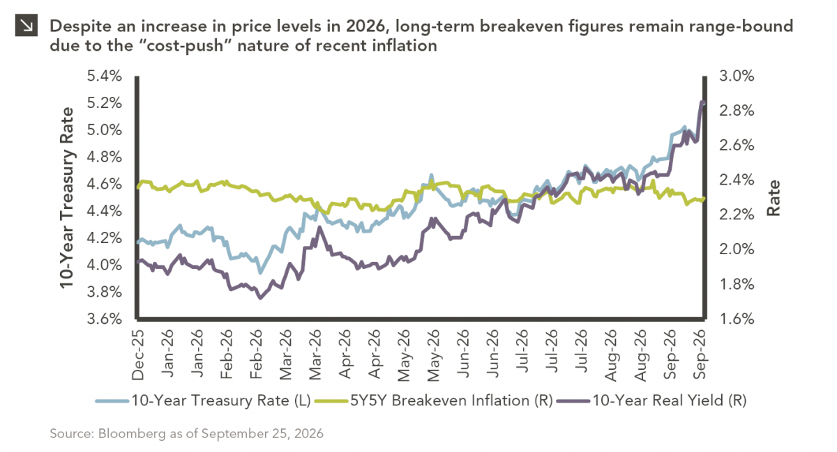
The phrase “expectations of higher inflation” has become a staple in financial news to explain the increase in nominal U.S….
Research alerts keep you updated on our latest research publications. Simply enter your contact information, choose the research alerts you would like to receive and click Subscribe. Alerts will be sent as research is published.
We respect your privacy. We will never share or sell your information.
If you have questions or need further information, please contact us directly and we will respond to your inquiry within 24 hours.
Contact Us >