David Hernandez, CFA
Director of Traditional Manager Search


This Chart of the Week examines home builders’ expectations of the newly built single family home market measured by the NAHB/Wells Fargo Housing Market Index (“HMI”). The HMI is based on a monthly survey conducted by the National Association of Home Builders. The index measures home builders’ perceptions of current sales, sales expectations for the next six months, and traffic of prospective buyers for newly built single family homes. An index value over 50 signifies more builders consider sales conditions good rather than poor.
While still below 50, the HMI has increased over the last five months and is now at a level of 40, which was last seen in June 2006. The improvement in builders’ confidence along with a gradual upward trend in existing home sales and stabilization of home prices are signs of modest improvement in the housing market after a historic collapse from the 2008 financial crisis. Historically low mortgage rates and attractive price opportunities have helped to stabilize the current housing market. However, a number of challenges remain, including high unemployment, a large number of looming foreclosures, strict credit standards, higher required down payments, and current underwater mortgages for would be buyers.

The opinions expressed herein are those of Marquette Associates, Inc. (“Marquette”), and are subject to change without notice. This material is not financial advice or an offer to purchase or sell any product. Marquette reserves the right to modify its current investment strategies and techniques based on changing market dynamics or client needs.
10.19.2026
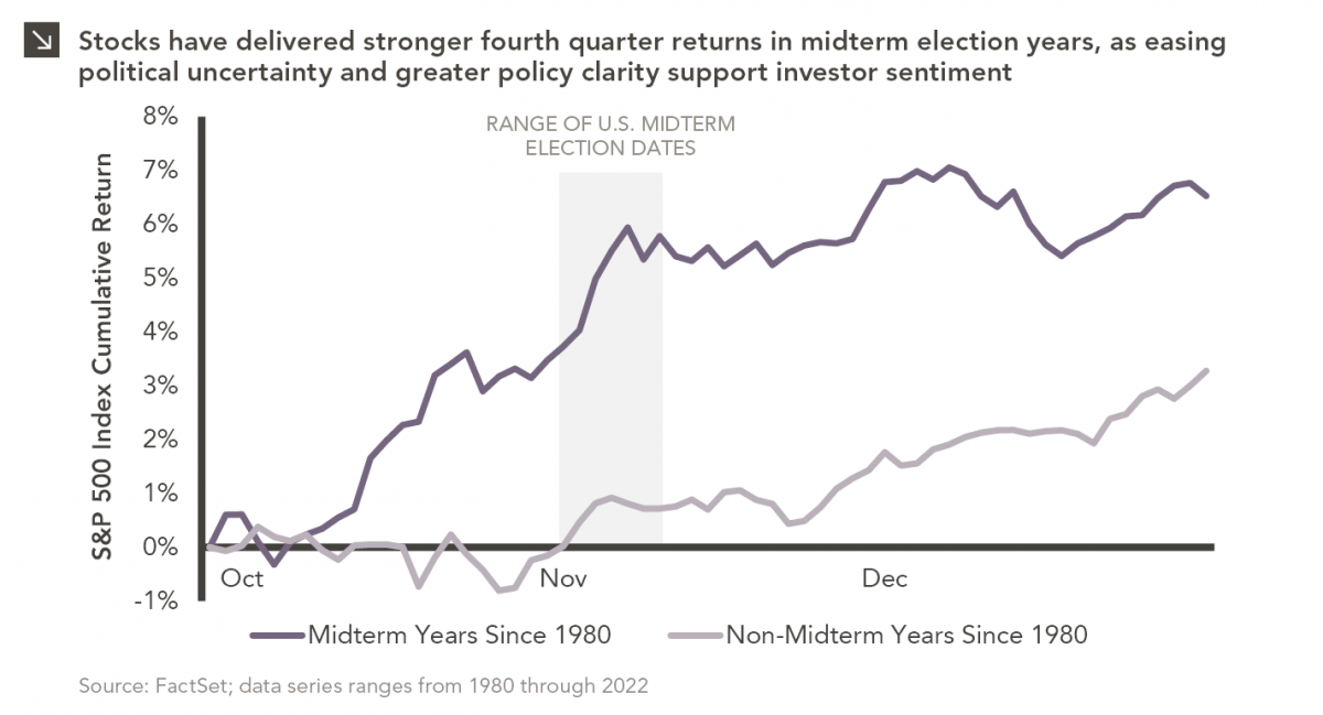
Since 1980, the S&P 500 Index has generally performed well in the weeks surrounding U.S. midterm elections. Specifically, the index…
10.12.2026
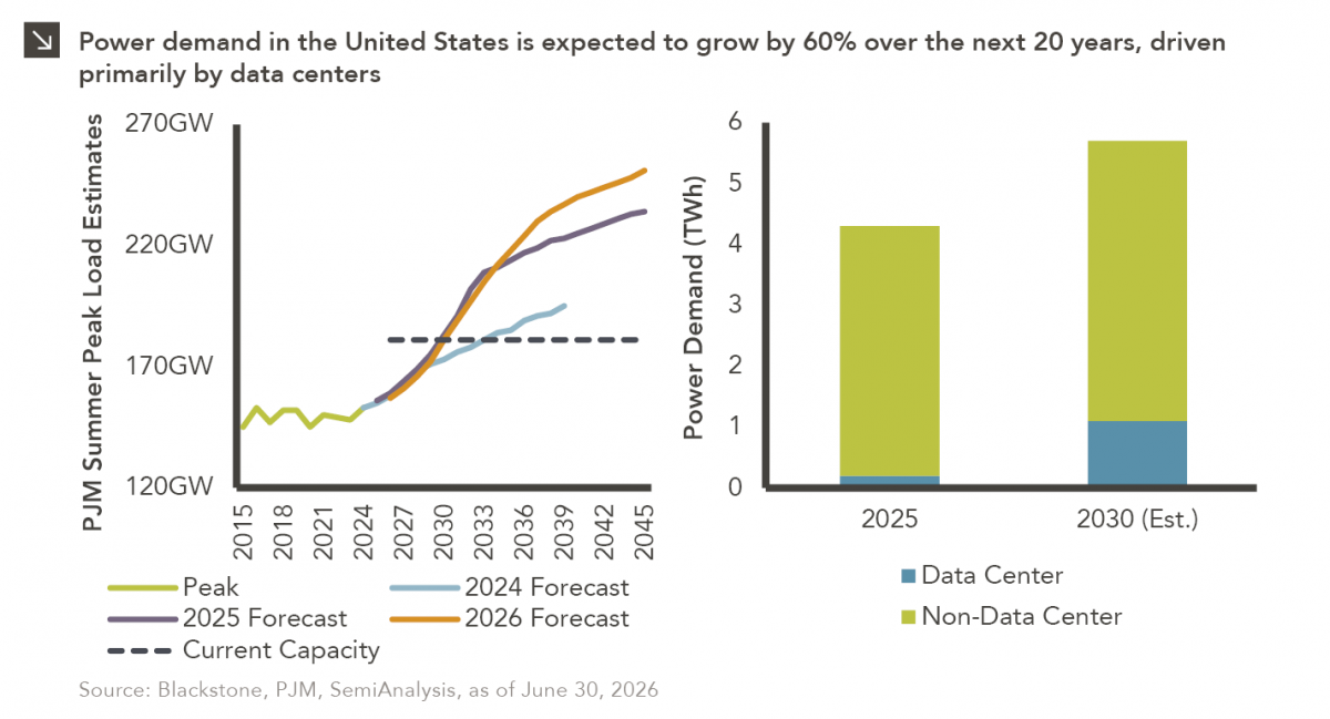
This week’s chart highlights the accelerating growth of electricity demand in the U.S., which has been driven primarily by the…

10.08.2026
LIVE WEBINAR — OCTOBER 22 Please join Marquette’s research team for our 3Q 2026 Market Insights Webinar…
10.05.2026
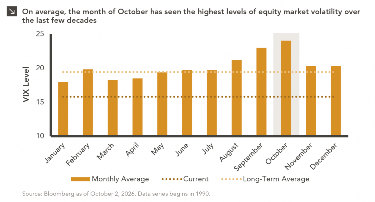
For investors, the spookiest thing about October might not be the ghosts and monsters that are bound to show up…
09.28.2026
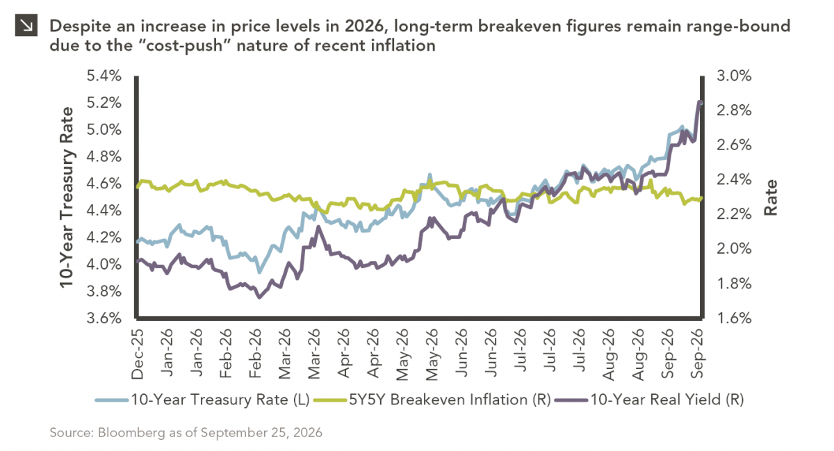
The phrase “expectations of higher inflation” has become a staple in financial news to explain the increase in nominal U.S….
09.21.2026
For much of the past several years, the conventional view has been that higher interest rates and stretched valuations would…
Research alerts keep you updated on our latest research publications. Simply enter your contact information, choose the research alerts you would like to receive and click Subscribe. Alerts will be sent as research is published.
We respect your privacy. We will never share or sell your information.
If you have questions or need further information, please contact us directly and we will respond to your inquiry within 24 hours.
Contact Us >