10.22.2026
Will Higher Rates Cramp the Markets?
Anyone who has run a marathon knows the last six miles are brutal — no matter how well the first…


Since the S&P 500 bottomed on March 23rd, the stock market has taken off while economic fundamentals have worsened. As of May 15th, the S&P 500 was up 28.4% from its trough while unemployment stands at 14.7%, April retail sales fell 16.4%, and industrial activity dropped by 15.5%. The S&P 500 has recouped more than 50% of its losses and sits just 15% below its all-time high.
Digging deeper into the underlying performance of the market, it becomes evident that not all of Wall Street has participated in the rebound. Market breadth, which compares the number of stocks that have gained relative to the ones that have declined, has been especially narrow. As a result, the market can be separated into a relatively few “Haves” and many “Have Nots.” The “Haves” are the largest five companies in the S&P 500: Facebook, Apple, Amazon, Microsoft, and Google (FAAMG) and the “Have Nots” are the other 495 companies in the index. Year-to-date as of May 15, 2020, the top five stocks returned 11.8% and outperformed the bottom 495 stocks before, during, and after the market decline. The bottom 495 stocks returned -15.3% year-to-date, representing a 27% performance gap. This leads us to two questions: Is the market rebound warranted? And, will the performance dispersion between the “Haves” and “Have Nots” fade anytime soon?
Equity markets are a forward-looking indicator of economic and corporate conditions. Yes, current fundamentals are not good, but analysts expect economic growth and corporate earnings to rebound later this year and into 2021, along with the development and release of a vaccine that can eradicate further outbreaks of COVID-19. In addition, stock markets often trough before the release of the worst economic data and before recessions end. Therefore, the forward-looking nature of the market seems to justify the market rebound to date.
Regarding the “Haves” and “Have Nots”, the market seems to believe the winners are large Technology companies and the losers are everyone else and/or any company exposed to COVID-19. There is fundamental support to favoring FAAMG. For example, Microsoft reported a 15% increase in sales, Google surpassed revenue expectations despite the potential for a decrease in advertising sales, and Apple has one of the most cash-rich balance sheets in the country. So, it is plausible that these stocks can continue to outperform. The longest period of similarly narrow breadth occurred in the two-plus years leading up to the bursting of the Tech Bubble. Consequently, periods of narrow breadth are often a harbinger of market declines and have “signaled below-average 1-, 3-, and 6-month S&P 500 returns as well as larger-than-average prospective drawdowns.”¹ We know that eventually the other 495 stocks in the S&P 500 will have more attractive fundamentals and will command higher prices. At that point, the return dispersion between the “Haves” and “Have Nots” will normalize, we just do not know when, though it will likely coincide with more positive economic data and greater containment of the coronavirus pandemic.
Print PDF > There’s FAAMG and Everyone Else
¹ Goldman Sachs Portfolio Strategy Research, May 1, 2020. “U.S. Weekly Kickstart.”
The opinions expressed herein are those of Marquette Associates, Inc. (“Marquette”), and are subject to change without notice. This material is not financial advice or an offer to purchase or sell any product. Marquette reserves the right to modify its current investment strategies and techniques based on changing market dynamics or client needs.

10.22.2026
Anyone who has run a marathon knows the last six miles are brutal — no matter how well the first…
10.19.2026
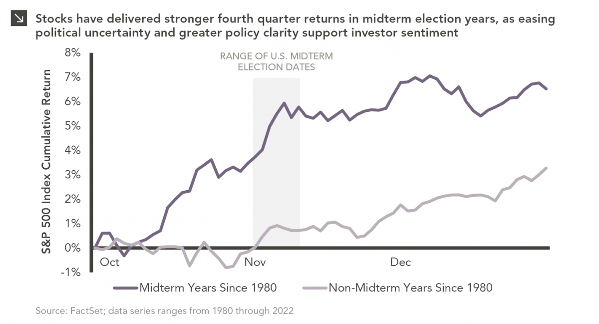
Since 1980, the S&P 500 Index has generally performed well in the weeks surrounding U.S. midterm elections. Specifically, the index…
10.12.2026
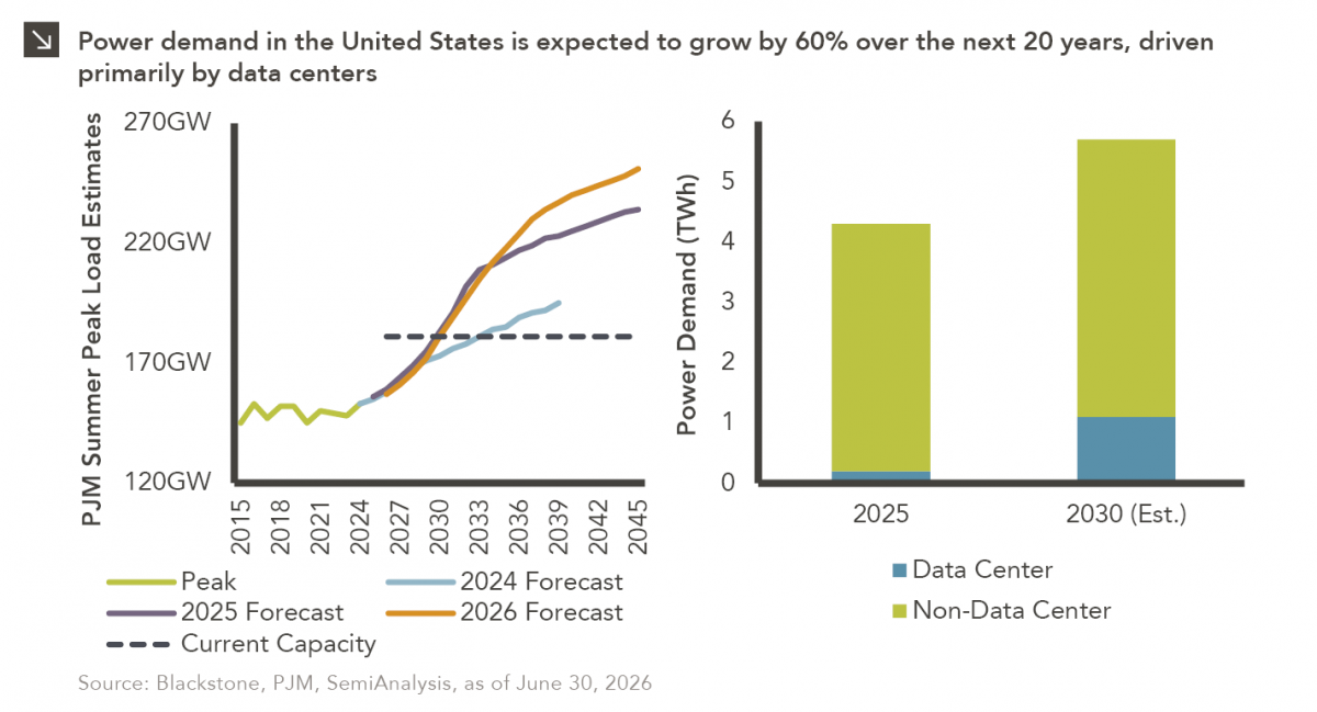
This week’s chart highlights the accelerating growth of electricity demand in the U.S., which has been driven primarily by the…

10.08.2026
LIVE WEBINAR — OCTOBER 22 Please join Marquette’s research team for our 3Q 2026 Market Insights Webinar…
10.05.2026
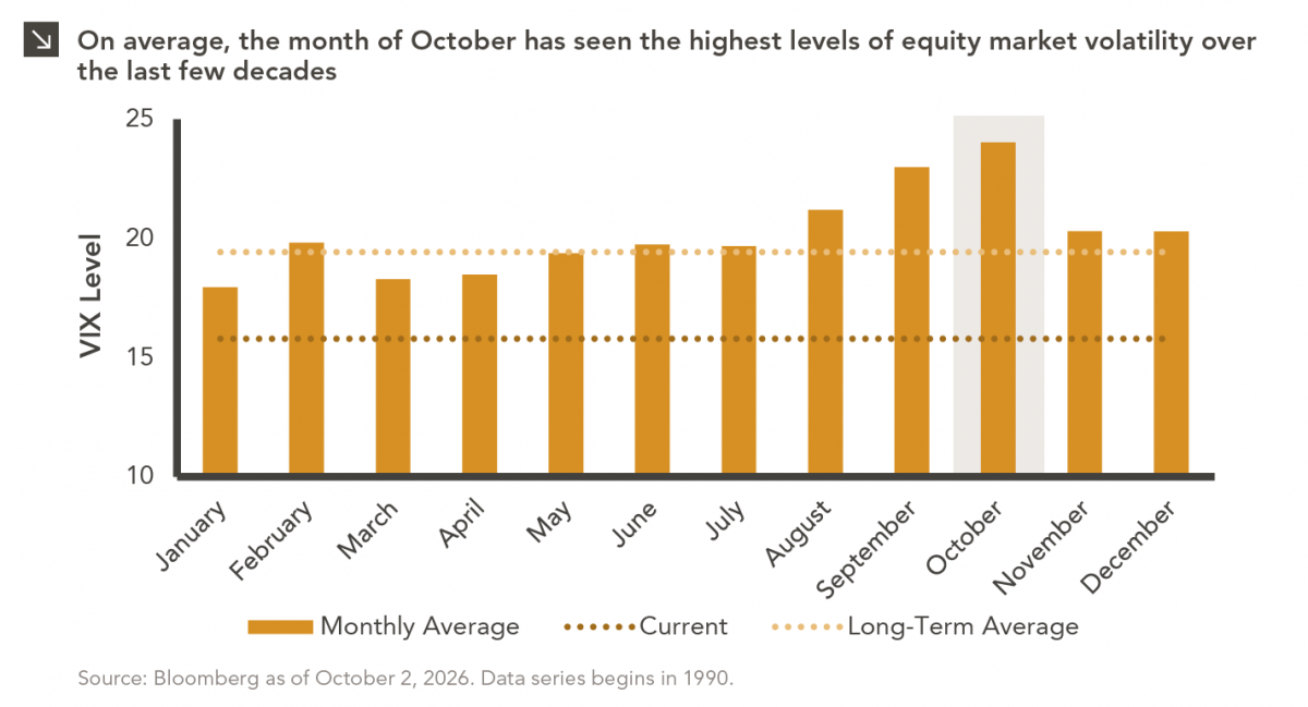
For investors, the spookiest thing about October might not be the ghosts and monsters that are bound to show up…
09.28.2026
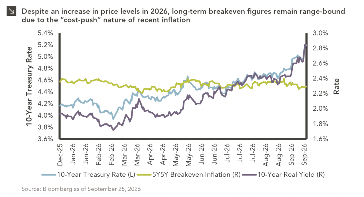
The phrase “expectations of higher inflation” has become a staple in financial news to explain the increase in nominal U.S….
Research alerts keep you updated on our latest research publications. Simply enter your contact information, choose the research alerts you would like to receive and click Subscribe. Alerts will be sent as research is published.
We respect your privacy. We will never share or sell your information.
If you have questions or need further information, please contact us directly and we will respond to your inquiry within 24 hours.
Contact Us >