10.08.2026
3Q 2026 Market Insights
This video is a recording of a live webinar held October 22 by Marquette’s research team analyzing the third quarter…


There has been much talk about a potential “Grexit,” as some believe it is inevitable and may be the best solution in the long run. Nonetheless, Greece is receiving its third bailout in five years to prevent such a thing. The new bailout plan comes with some tough austerity measures in which Greece will have to make cuts to pensions and increase taxes in order to receive €86B ($96B) in new loans.
The fear of contagion has been cited as a reason for yet another Greek bailout. If Greece were to leave the Eurozone, a dangerous precedent may be set and other countries with high debt levels (such as Spain, Italy, and Portugal) may decide to follow. Even if these countries do stay, they may have difficulty finding investors to purchase their bonds. On the other hand, by continuing to bail out Greece, these countries may be less willing to make reforms and come to expect their own bailouts if their debt gets out of hand.
However, this week’s chart puts the Greece situation into perspective, particularly for U.S. investors. For all the attention Greece receives, it has a smaller economy than the state of Wisconsin and is less than half the size of Illinois. Even among the Eurozone, Greece contributes a mere 1.9% to the area’s GDP. Though there is the possibility of a domino effect, it seems unlikely that the events in Greece will have a large effect on the global economy.
The opinions expressed herein are those of Marquette Associates, Inc. (“Marquette”), and are subject to change without notice. This material is not financial advice or an offer to purchase or sell any product. Marquette reserves the right to modify its current investment strategies and techniques based on changing market dynamics or client needs.

10.08.2026
This video is a recording of a live webinar held October 22 by Marquette’s research team analyzing the third quarter…

10.22.2026
Anyone who has run a marathon knows the last six miles are brutal — no matter how well the first…
10.19.2026
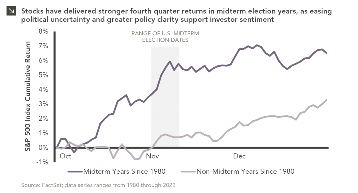
Since 1980, the S&P 500 Index has generally performed well in the weeks surrounding U.S. midterm elections. Specifically, the index…
10.12.2026
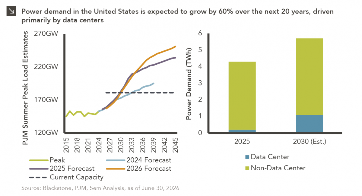
This week’s chart highlights the accelerating growth of electricity demand in the U.S., which has been driven primarily by the…
10.05.2026
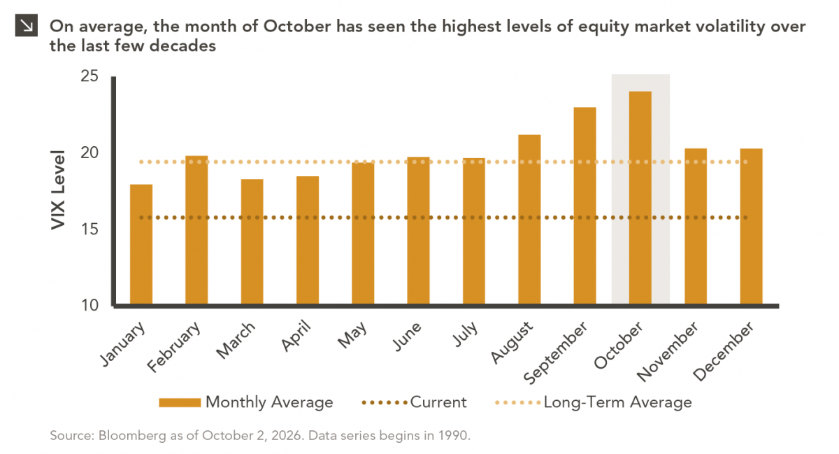
For investors, the spookiest thing about October might not be the ghosts and monsters that are bound to show up…
09.28.2026
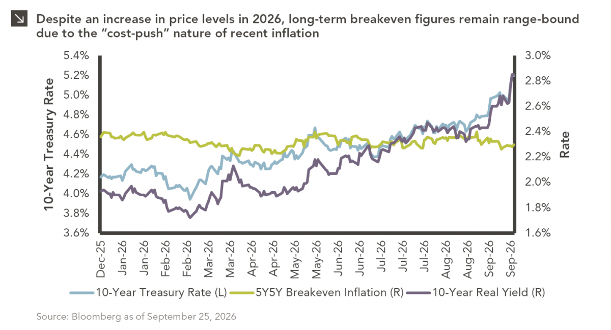
The phrase “expectations of higher inflation” has become a staple in financial news to explain the increase in nominal U.S….
Research alerts keep you updated on our latest research publications. Simply enter your contact information, choose the research alerts you would like to receive and click Subscribe. Alerts will be sent as research is published.
We respect your privacy. We will never share or sell your information.
If you have questions or need further information, please contact us directly and we will respond to your inquiry within 24 hours.
Contact Us >