10.22.2026
Will Higher Rates Cramp the Markets?
Anyone who has run a marathon knows the last six miles are brutal — no matter how well the first…


Activist hedge fund managers seek to outperform the equity markets over a market cycle by first purchasing a large number of shares in publicly traded companies and then pushing these companies’ management teams to alter their approaches in an effort to unlock shareholder value. Some common practices include share buybacks, spinoffs, and strategic sales.
Asset flows into activist hedge funds have more than doubled since 2011 and grown six-fold over the last 10 years making this a highly embraced strategy among hedge fund investors. Latest Hedge Fund Research, Inc (HFR) data estimates assets under management to be over $120bn among activist hedge funds.
Unfortunately, this week’s chart illustrates that returns produced by activist hedge funds have been quite underwhelming, trailing the S&P 500 index over the most recent 1-, 3-, 5-, and 7-year annualized periods through December 31, 2015 (data for the HFRI Activist Index does not go back far enough for us to run a 10-year return comparison between the two indices). Out of the approximately 120 activist hedge funds in business today, there are many who do not report performance to HFR so the comparison is not perfect. However, the index does serve as a reasonable proxy for the industry.
We show activist index returns relative to S&P 500 index returns because activist strategies are marketed as an equities substitute and most institutional investors view them as such. Therefore, the opportunity cost for investors tends to be returns which they would have otherwise obtained through an investment in a long only equity fund benchmarked to a broad market index like the S&P 500. Thus, while most activist funds’ strategies are well-intentioned, returns have struggled to maintain pace with the broad U.S. equity market.
The opinions expressed herein are those of Marquette Associates, Inc. (“Marquette”), and are subject to change without notice. This material is not financial advice or an offer to purchase or sell any product. Marquette reserves the right to modify its current investment strategies and techniques based on changing market dynamics or client needs.

10.22.2026
Anyone who has run a marathon knows the last six miles are brutal — no matter how well the first…
10.19.2026
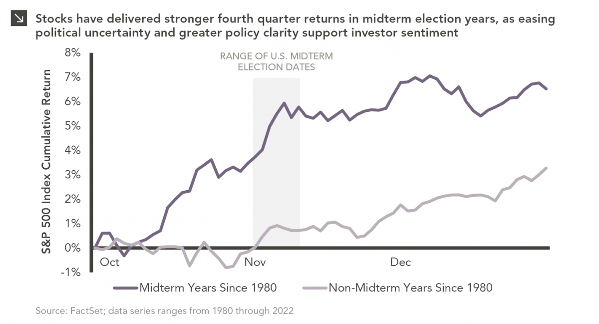
Since 1980, the S&P 500 Index has generally performed well in the weeks surrounding U.S. midterm elections. Specifically, the index…
10.12.2026
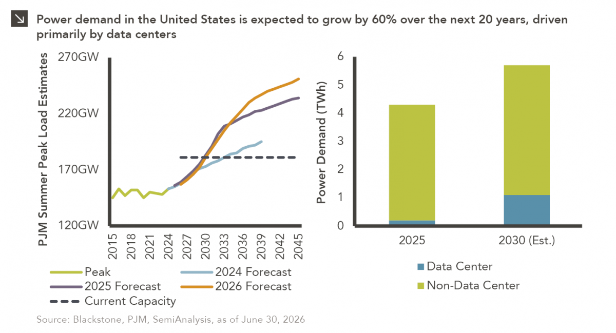
This week’s chart highlights the accelerating growth of electricity demand in the U.S., which has been driven primarily by the…

10.08.2026
LIVE WEBINAR — OCTOBER 22 Please join Marquette’s research team for our 3Q 2026 Market Insights Webinar…
10.05.2026
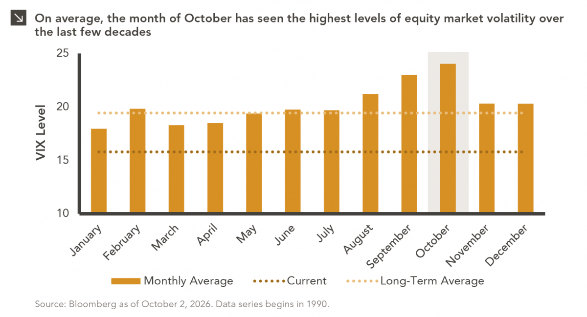
For investors, the spookiest thing about October might not be the ghosts and monsters that are bound to show up…
09.28.2026
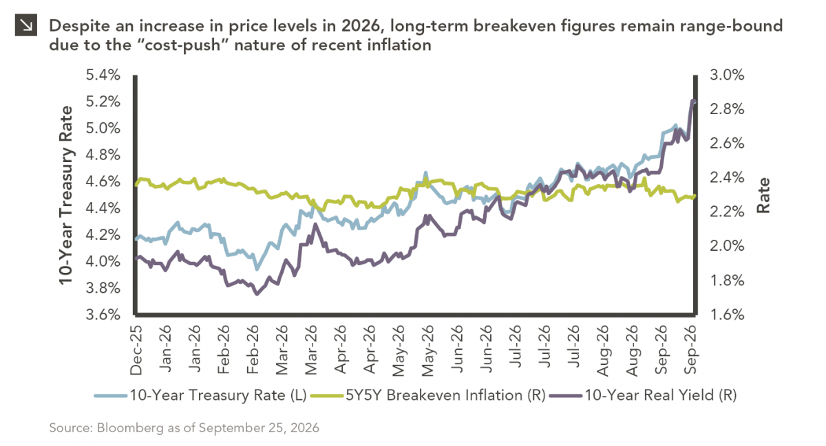
The phrase “expectations of higher inflation” has become a staple in financial news to explain the increase in nominal U.S….
Research alerts keep you updated on our latest research publications. Simply enter your contact information, choose the research alerts you would like to receive and click Subscribe. Alerts will be sent as research is published.
We respect your privacy. We will never share or sell your information.
If you have questions or need further information, please contact us directly and we will respond to your inquiry within 24 hours.
Contact Us >