Evan Frazier, CFA, CAIA
Senior Research Analyst


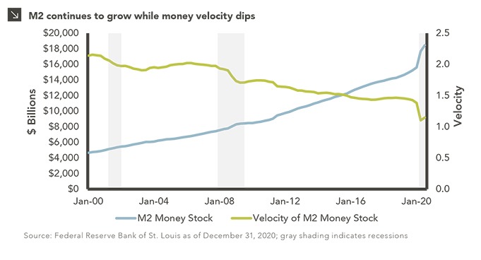
Inflation has remained well below 3% in the United States for nearly a decade despite a record economic expansion and supportive monetary policy. Even after unprecedented alterations to the macroeconomic landscape in recent months, investors have not seen the significant price level increases that might have been expected in theory. This puzzling situation may be at least partially explained by the current relationship between money supply and velocity.
When it comes to economic relief efforts in the U.S. during 2020, no entity has been more active than the Federal Reserve, which has increasingly relied on open market operations with short-term interest rates near zero. Since the start of the pandemic, the Fed has purchased $3.5 trillion in Treasuries, corporate bonds, and mortgage-backed securities, and recently announced its intention to press forward with $120 billion per month in additional bond buying. The central bank’s balance sheet has now ballooned to over $7 trillion. As a result, M2 — a measure of the total money supply that includes narrow money, cash equivalents, and short-term deposits — spiked by roughly 25% in 2020, a record year-over-year growth figure.¹ The recent M2 surge has been accompanied by a decrease in the velocity of money, calculated as the ratio of quarterly nominal GDP to the quarterly average of M2 money stock. Put simply, velocity denotes the rate of turnover in the money supply and is a gauge of economic health, as higher velocity is usually associated with more robust economic activity. Since the beginning of 2020, money velocity has fallen by more than 20%, indicating a strong preference for saving vs. spending on the part of the American consumer since the outbreak of COVID-19.
The relationship between money supply and velocity has significant implications for security markets going forward, particularly as it relates to inflation. Investors have long been confounded by the absence of inflation in the U.S. since low interest rates and M2 growth should lead to higher price levels all else equal. Part of the reason for the lack of inflation could be lower levels of money velocity, which has largely declined since 2000 amid three significant recessions in the United States. The recent plunge in velocity may signal to central bankers that expansionary efforts could be continued in the near term without the risk of significant price level increases. As the economic recovery continues, however, velocity will necessarily rise, which could lead to interest rate hikes and the tapering of the Fed balance sheet to prevent runaway inflation. Investors should be cognizant of the possibility of restrictive monetary policy in the coming years as the world lifts itself out of recession.
Print PDF > Is Velocity Stifling Inflation Amid Record Growth of Money Supply
¹As measured on November 30, 2020

The opinions expressed herein are those of Marquette Associates, Inc. (“Marquette”), and are subject to change without notice. This material is not financial advice or an offer to purchase or sell any product. Marquette reserves the right to modify its current investment strategies and techniques based on changing market dynamics or client needs.

10.08.2026
This video is a recording of a live webinar held October 22 by Marquette’s research team analyzing the third quarter…

10.22.2026
Anyone who has run a marathon knows the last six miles are brutal — no matter how well the first…
10.19.2026
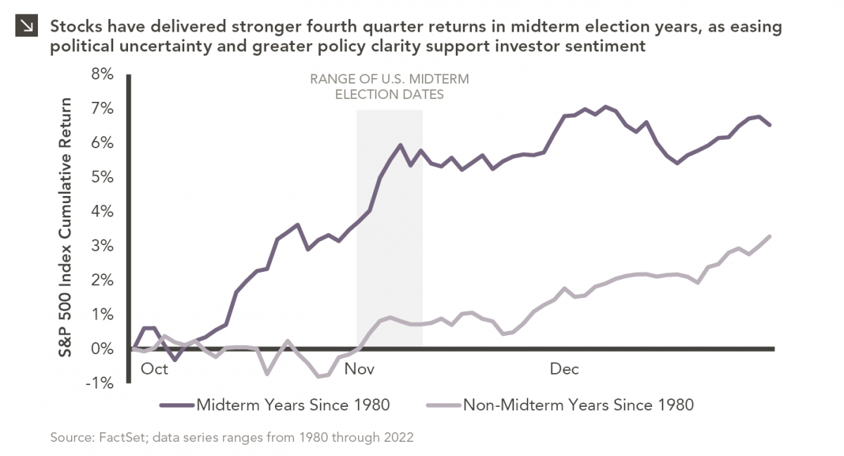
Since 1980, the S&P 500 Index has generally performed well in the weeks surrounding U.S. midterm elections. Specifically, the index…

10.12.2026
This week’s chart highlights the accelerating growth of electricity demand in the U.S., which has been driven primarily by the…

10.05.2026
For investors, the spookiest thing about October might not be the ghosts and monsters that are bound to show up…

09.28.2026
The phrase “expectations of higher inflation” has become a staple in financial news to explain the increase in nominal U.S….
Research alerts keep you updated on our latest research publications. Simply enter your contact information, choose the research alerts you would like to receive and click Subscribe. Alerts will be sent as research is published.
We respect your privacy. We will never share or sell your information.
If you have questions or need further information, please contact us directly and we will respond to your inquiry within 24 hours.
Contact Us >