09.08.2026
EMD’s Second Chance?
Over the last several years, emerging market debt (EMD) has faced several headwinds, with rising yields across other fixed income…


While the above curves are simple in appearance, they can hold great predictive power for investors. Futures curves are just as they sound: future price speculation on a given day. The red line represents the futures pricing of WTI Crude Oil as of November 28th, just a few days before OPEC members decided to cut output in the hopes of combating oversupply and ultimately raising oil prices. Purchasing futures on oil for delivery in July of 2017 would give the futures owner the right to sell oil at a price of about $50/barrel. This investment strategy is often employed by speculators, hedge funds, and producers. Producers are able to hedge their exposure to oil and buy futures as a pseudo insurance policy as it locks in the price at which they can sell oil at some point in the future.
The blue curve is shifted dramatically upwards because it represents the futures pricing of oil on December 5th, just days after the OPEC meeting. After OPEC members agreed to rein in production, prices rose dramatically: 13% in just 2 days. While this near-term shift upwards makes sense, the inverted portion of the curve tells an additional story. The inversion referenced in the chart suggests a strong producer hedging presence in the market; oil producers wanting to buy futures on oil outnumbered speculators that would take the other end of this bet. To compensate for this disparity, producers will accept a slightly lower price for the security of locking in a sales price now. The enthusiasm with which producers were locking in their future sales price may imply that producers do not believe oil prices will increase a significant amount within the near future. In other words, perhaps they are not incredibly optimistic about the outcome of this OPEC deal.
The deal’s success does face some challenges. Recently, a few African OPEC member countries have actually increased their output as they are not held to the OPEC cut obligations due to extenuating domestic circumstances, meaning other member countries will need to compensate via further reductions. More generally, many did not believe the group could reach an agreement, so that a deal was even reached is an optimistic sign for oil. While the reliability of the member countries is questioned by some, ultimately we will see if the group has been successfully cutting production in the coming months as output data is released. If the cuts are made then we may continue to see the price of oil rise in 2017.
The opinions expressed herein are those of Marquette Associates, Inc. (“Marquette”), and are subject to change without notice. This material is not financial advice or an offer to purchase or sell any product. Marquette reserves the right to modify its current investment strategies and techniques based on changing market dynamics or client needs.
09.08.2026
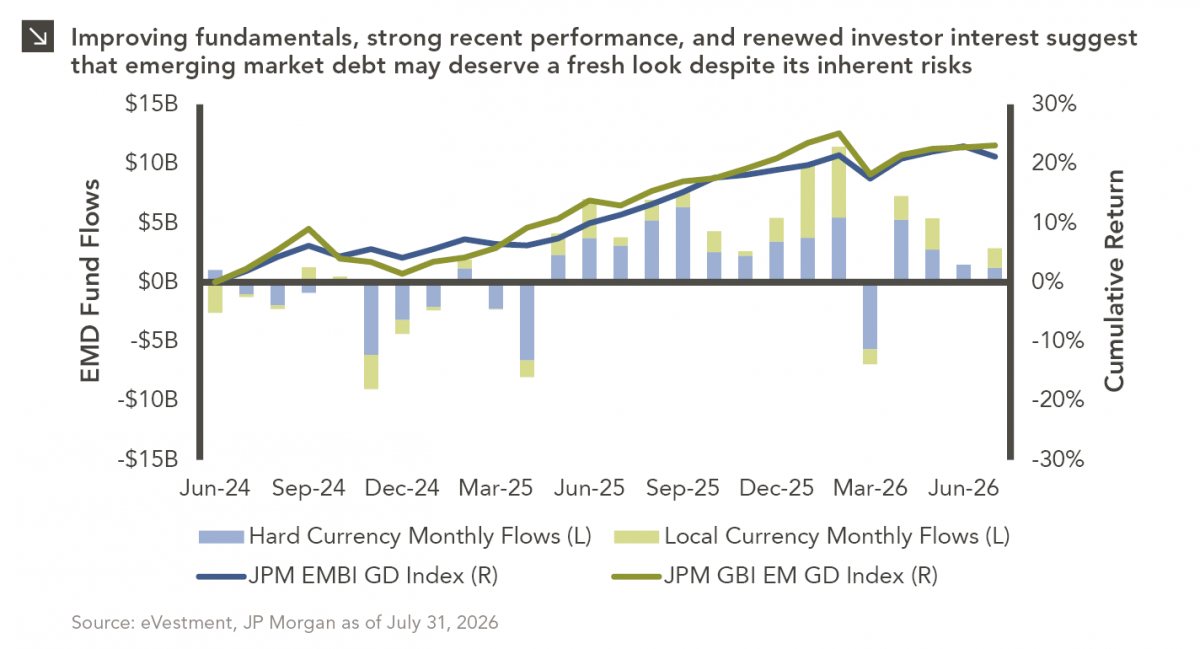
Over the last several years, emerging market debt (EMD) has faced several headwinds, with rising yields across other fixed income…
08.31.2026
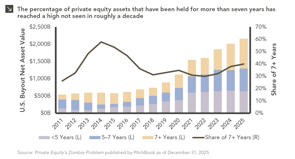
Private equity has always had a few portfolio companies that refused to leave the party. Today, however, the industry appears…
08.24.2026
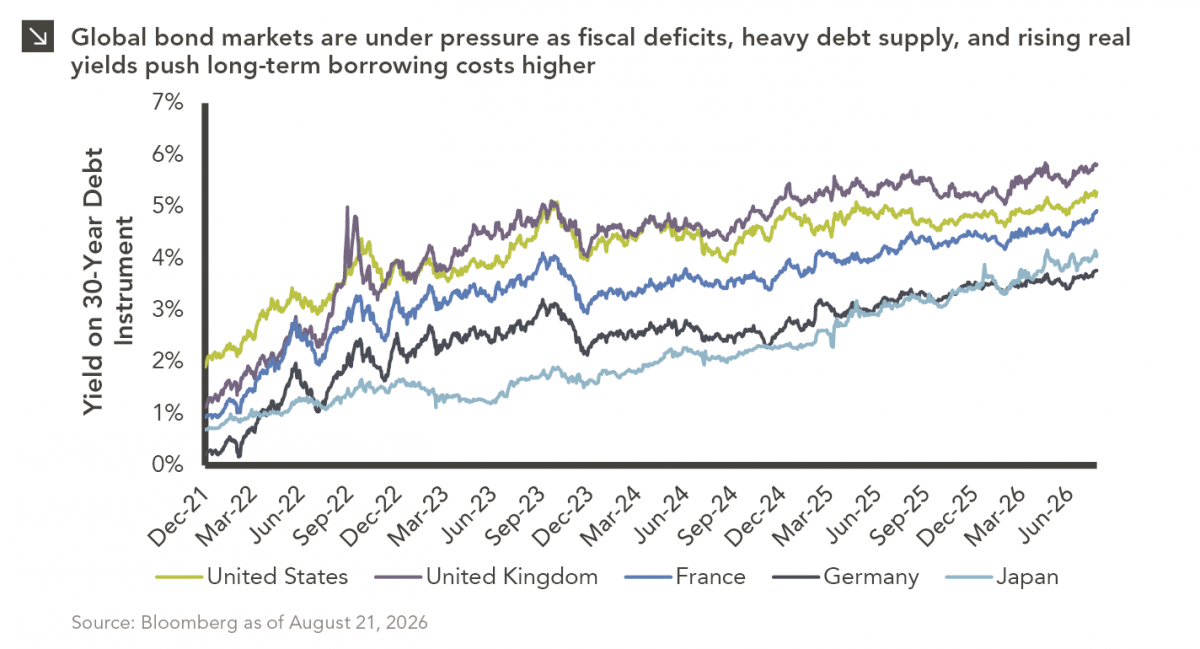
The global bond market is facing renewed pressure as investors demand higher yields to hold long-dated government debt, pushing borrowing…
08.17.2026
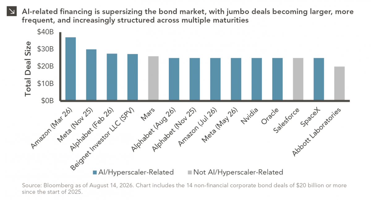
As a college football player struggling to put on mass, the “supersizing” deal at McDonald’s was hard to beat. For…
08.10.2026
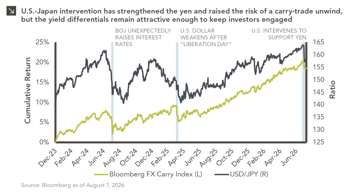
After reaching nearly ¥164 per dollar, its weakest level in roughly four decades, the yen had become a source of…
08.03.2026
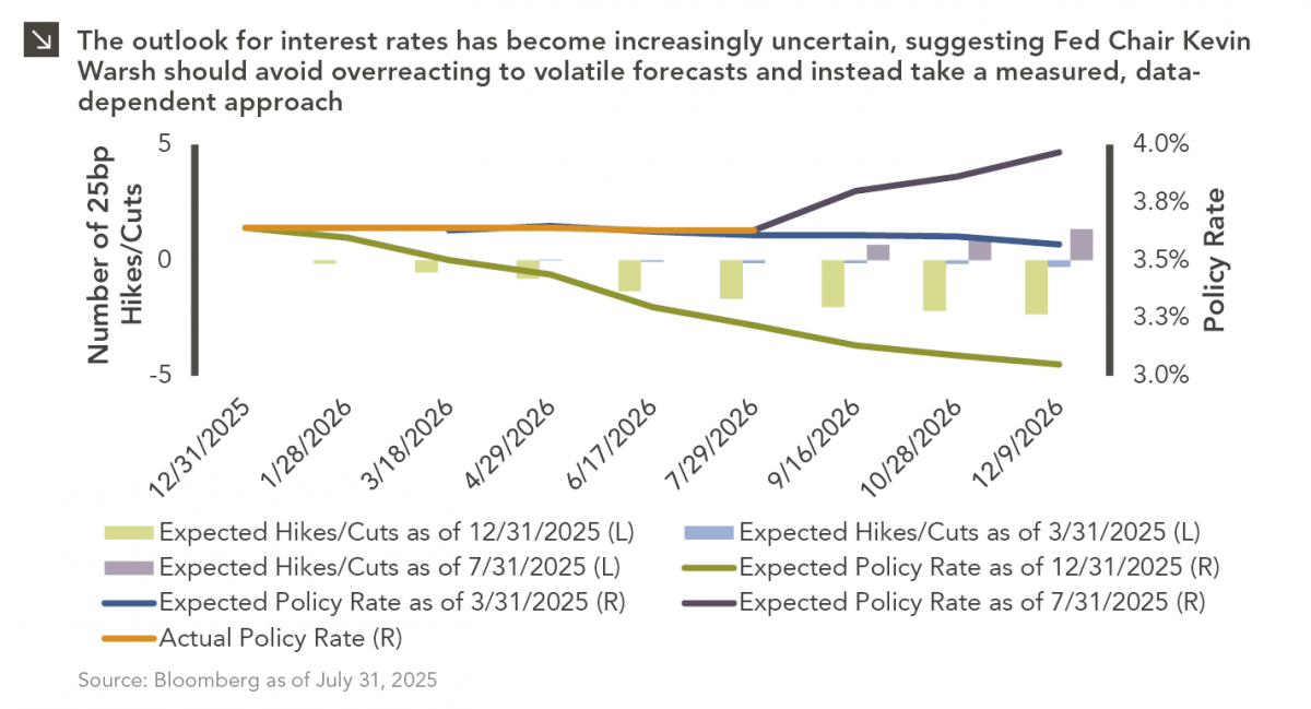
In the cinematic masterpiece Rocky IV, Rocky gets dazed by his opponent, Captain Ivan Drago, and complains that he sees…
Research alerts keep you updated on our latest research publications. Simply enter your contact information, choose the research alerts you would like to receive and click Subscribe. Alerts will be sent as research is published.
We respect your privacy. We will never share or sell your information.
If you have questions or need further information, please contact us directly and we will respond to your inquiry within 24 hours.
Contact Us >