10.22.2026
Will Higher Rates Cramp the Markets?
Anyone who has run a marathon knows the last six miles are brutal — no matter how well the first…


The ferocious appetite for Special Purpose Acquisition Companies (SPACs) continued its momentum throughout the first quarter of 2021. Investors could not get enough of this asset class as a record amount of capital flowed into the space. Through March, 2021 has already seen more SPAC IPOs than all of 2020, with over 300 new deals coming to market. Similarly, gross proceeds thus far through April are already over $100B, well past the $83B that was raised throughout 2020. The space has gotten so hot that sports celebrities like Shaquille O’Neal, Colin Kaepernick, and Alex Rodriguez have all put their names on SPACs that have recently hit the market.
Can this momentum continue? The Securities and Exchange Commission (SEC) might have something to say about it. Earlier this month, the SEC issued new accounting guidance that would classify SPAC warrants as liabilities instead of as equity instruments, as they are currently classified. Warrants are given to capital providers like hedge funds that put up the capital for SPACs before an IPO, to offer the capital provider more upside once the company goes public. SPAC IPOs have since slowed, as affected SPACs would have to restate their financials if this becomes law. With this risk on the table, investors may begin to look elsewhere to put their capital to work, dampening this SPAC market frenzy.
Print PDF > What’s Next for SPACs?
The opinions expressed herein are those of Marquette Associates, Inc. (“Marquette”), and are subject to change without notice. This material is not financial advice or an offer to purchase or sell any product. Marquette reserves the right to modify its current investment strategies and techniques based on changing market dynamics or client needs.

10.22.2026
Anyone who has run a marathon knows the last six miles are brutal — no matter how well the first…
10.19.2026
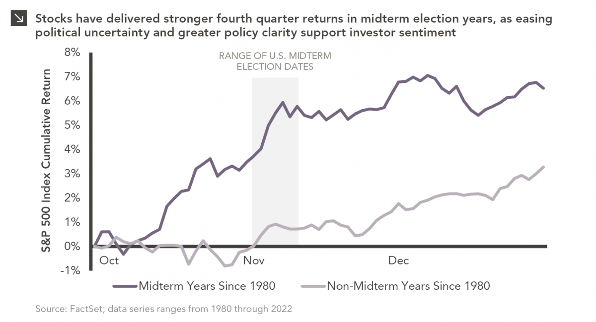
Since 1980, the S&P 500 Index has generally performed well in the weeks surrounding U.S. midterm elections. Specifically, the index…
10.12.2026
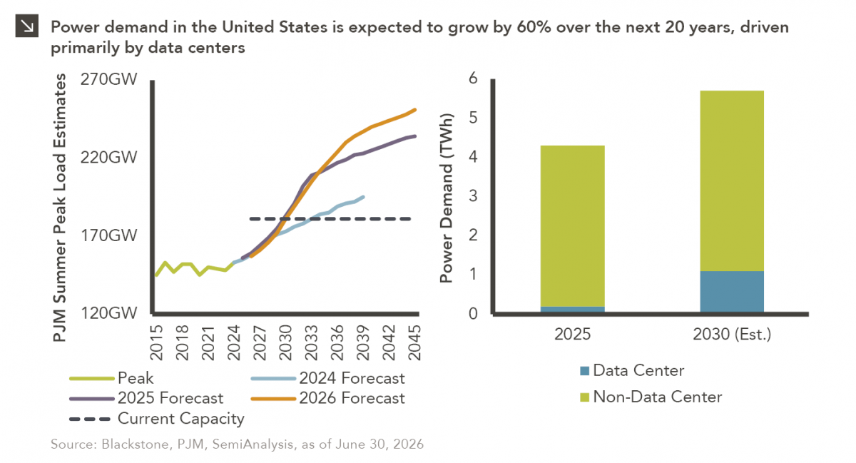
This week’s chart highlights the accelerating growth of electricity demand in the U.S., which has been driven primarily by the…

10.08.2026
LIVE WEBINAR — OCTOBER 22 Please join Marquette’s research team for our 3Q 2026 Market Insights Webinar…
10.05.2026
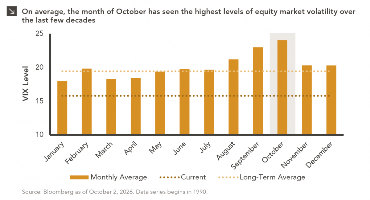
For investors, the spookiest thing about October might not be the ghosts and monsters that are bound to show up…
09.28.2026
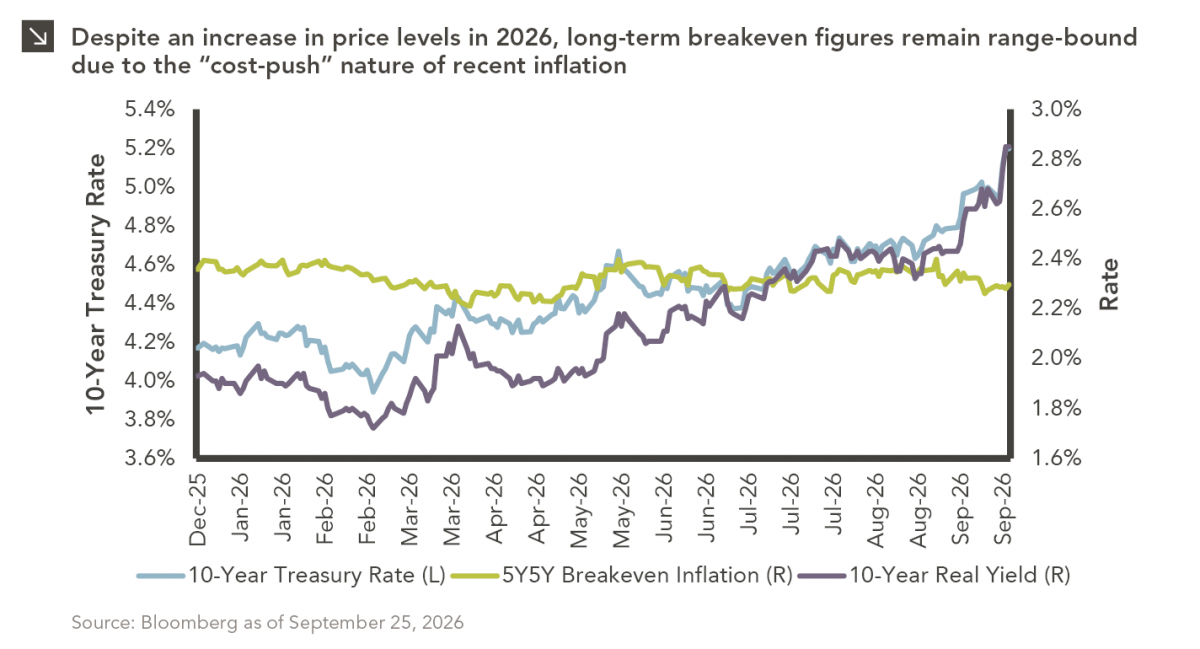
The phrase “expectations of higher inflation” has become a staple in financial news to explain the increase in nominal U.S….
Research alerts keep you updated on our latest research publications. Simply enter your contact information, choose the research alerts you would like to receive and click Subscribe. Alerts will be sent as research is published.
We respect your privacy. We will never share or sell your information.
If you have questions or need further information, please contact us directly and we will respond to your inquiry within 24 hours.
Contact Us >