Do Election Results Predict Equity Market Performance?

During election seasons we are frequently asked about what will happen to the market if a particular candidate or party wins, or whether certain years of the presidential cycle are better for investors.  

During election seasons we are frequently asked about what will happen to the market if a particular candidate or party wins, or whether certain years of the presidential cycle are better for investors. While there are numerous opinions about how differing public policies can affect the economy and financial markets — which goes well beyond the scope of this Chart of the Week — we can observe some trends from history. Since 1926, the first year of a presidential term on average is the weakest, while the third year generally performs well. The election year itself tends to be fairly average. Additionally, the market has generally performed better while a Democrat was sitting president, with an average return of 15% compared to 8.6% for Republican presidents.

While these trends seem interesting, it would be imprudent to make any market predictions based on this data. The historical data is extremely limited and undoubtedly a case of random patterns in a small data set rather than a legitimate correlation. For instance, an investor who only invested in the stock market when the NFC won the super bowl would significantly outperform one that invested when the AFC won (14.6% compared to 8.2%). Similar results can also be seen when investing in only odd years, or years that end with a certain digit (3, 5, etc). In order to be statistically significant, one would need over 2,000 election year data points to achieve a meaningful significance level. While there may or may not be particular reasons behind these realized returns patterns, from a statistical standpoint it would be unwise to base any investment decisions off of them.

Has Oil Driven Down the U.S. Equity Market?

Given the recent drops in oil and U.S. equity prices, many have concluded that the significant decline in oil prices has driven down the stock market.  Indeed, from the onset of oil’s sharp dip, correlation between the two daily returns has greatly increased to about 45% on a 6-month rolling basis.

Given the recent drops in oil and U.S. equity prices, many have concluded that the significant decline in oil prices has driven down the stock market. Indeed, from the onset of oil’s sharp dip, correlation between the two daily returns has greatly increased to about 45% on a 6-month rolling basis. Our chart this week examines if the correlation between oil prices and the equity market has always been so significant.

Going back to 1984, we graph the correlation between oil prices and the U.S. equity market (represented by the S&P 500 index) against the price of oil. Over this longer time period, it is quite apparent that the correlation is fluid, changing significantly across different time periods. Over the entire time period, the correlation averages only 7.7%. Certainly, in times of oil price volatility, correlation tends to rise between oil prices and stock markets, but it is not consistent over time and thus not a reliable indicator of future stock market direction. Though correlation does not imply causality, oil’s apparent influence on investors’ nerves, and consequently the market, may be a temporary indicator of market sentiment.

2016 Market Preview

January 2016

Similar to previous years, we offer our annual market preview newsletter. Each year presents new challenges to our clients, and 2016 is off to a volatile start with equity markets down significantly, oil dropping below $30, the Fed poised to further increase interest rates, and fears of a China slowdown rippling through the markets. However, other headlines will emerge as the year goes on, and it is critical to understand how asset classes will react to each new development and what such reactions will mean to investors. The following articles contain insightful analysis and key themes to monitor over the coming year, themes which will underlie the actual performance of the asset classes covered.

Download PDF

How Much Longer Will Growth Outperform Value?

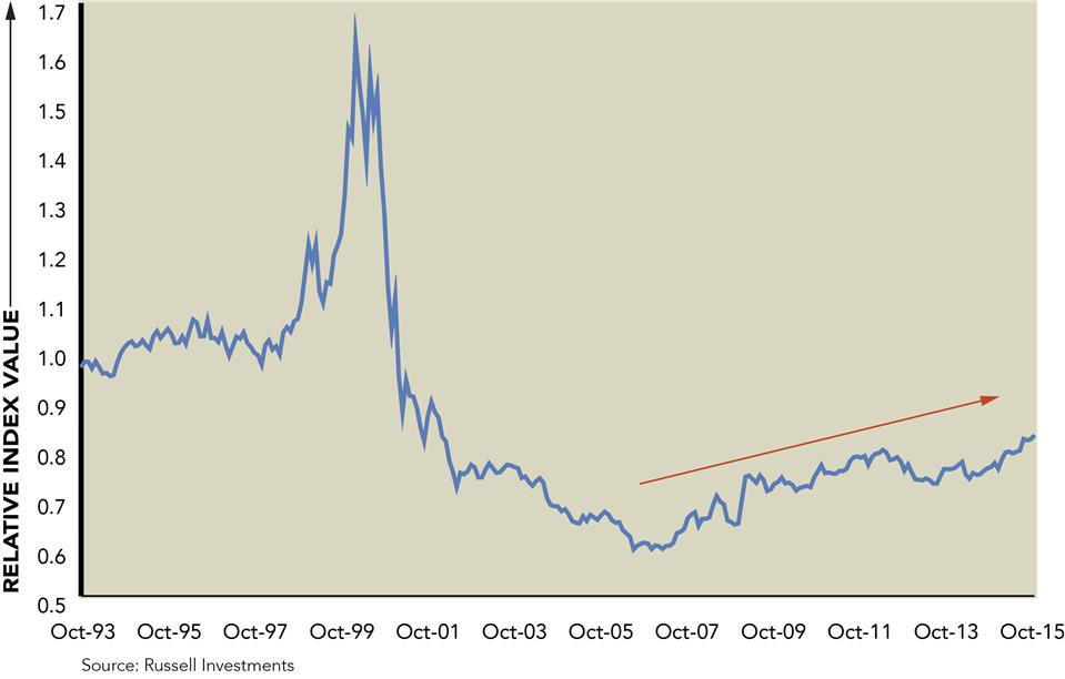
This week’s Chart of the Week examines the relative performance of growth versus value. The above chart shows the price level of the Russell 3000 Growth index relative to the Russell 3000 Value index. Growth is outperforming value when the line is in an uptrend and value is outperforming growth when the line is trending downward.

This week’s Chart of the Week examines the relative performance of growth versus value. The above chart shows the price level of the Russell 3000 Growth index relative to the Russell 3000 Value index. Growth is outperforming value when the line is in an uptrend and value is outperforming growth when the line is trending downward.

Investors may have noticed the recent outperformance of growth versus value year-to-date across small-, mid-, and large-cap. When viewed over a longer time horizon though, growth has outperformed value for almost ten years. The outperformance of growth prior to the tech bubble was much greater in magnitude; however, the current multi-year period of growth outperformance is the longest since the early 1980s.

One explanation for the current leadership of growth over value may simply be how these indices are constructed. Value indices feature a much larger allocation to the Financial and Energy sectors (representing approximately 43% of the Russell 3000 Value index as of 9/30/2015). When examining performance since the October 2007 market peak, Financials and Energy have lagged other sectors, posting cumulative returns of -20.8% and +3.1%, respectively. Areas such as Technology, Health Care, and Consumer Discretionary are among the best performing sectors since the October 2007 market peak and carry higher weightings within growth indices.

Over the long term, there will be periods when value is in favor and periods when growth is in favor. The duration of the current growth cycle calls into question how much longer growth’s outperformance will persist. Ultimately, it is extremely difficult to predict when the relative performance will shift, and yet another reminder that it is imperative to be diversified across the various size and style boxes of the U.S. equity market.

Are Retail Stocks on Sale?

Historically, the retail industry, a subset of the consumer discretionary sector, experiences an upswing during the winter months as holiday sales alone contribute 19% to yearly sales and Q4 earnings are generally released within the beginning of Q1. Highlighted in red is the November through February performance of the S&P Retail Select Industry Index; recession years aside, this upward trend usually holds.

Historically, the retail industry, a subset of the consumer discretionary sector, experiences an upswing during the winter months as holiday sales alone contribute 19% to yearly sales and Q4 earnings are generally released within the beginning of Q1. Highlighted in red is the November through February performance of the S&P Retail Select Industry Index; recession years aside, this upward trend usually holds.

In 2015, retail sales are expected to grow year over year by 3.7% and though this is a slight decrease from 2014’s 4.1% increase, it is still substantially above the 2.5% ten-year average. The U.S. employment rate is at a recent high of 94.8% however the participation rate has decreased to 62.4%, meaning that although the workforce appears to be buzzing along, some previous members of the workforce may be choosing to opt-out of their job searches and thus are less likely to take out their AMEX cards.

Though U.S. economic stats may be a mixed (gift) basket, currently the P/E ratio of the referenced retail index is at 22.37, down almost 30% year over year, making the retail industry seem attractive, especially for this time of year. Additionally, consumer confidence is currently at 97.6, modestly above the 93.8 level seen one year ago, leaving the U.S. consumer poised to shop ’til they drop.

How Have Capital Market Valuations Evolved Over the Last Year?

This week’s chart shows that current valuations across equity and fixed income markets are lower today compared to where they stood at the end of September last year. The big takeaway here is that equities broadly appear to still be cheaper than bonds.

This week’s chart shows that current valuations across equity and fixed income markets are lower today compared to where they stood at the end of September last year. The big takeaway here is that equities broadly appear to still be cheaper than bonds.

Japanese Government Bonds and German Bunds are some of the most expensive debt instruments currently available to investors. As it relates to the former, the Bank of Japan’s unprecedented stimulus has helped push Japanese Government Bond yields to record lows, and earlier this year, yields on securities with maturities up to five years turned negative for the first time. Looking ahead, the Fed’s willingness to delay an increase in U.S. interest rates should support demand for riskier assets and as a result, fixed income valuations may normalize over time. Compared to last year, the most precipitous drop in valuations has taken place in U.S. High Yield, U.S. Credit and U.S. dollar-denominated Emerging Markets Debt.

As it relates to equities, with the exception of the U.S., South Africa, and Mexico, valuations around other parts of the globe are on the lower end of their historical averages.  Finally, valuations in Canadian, Spanish, and Taiwanese equity markets have come down the most over the past year as these markets have sold off over the near term.

Note: Percentile ranks show valuations of assets versus their historical ranges. Example: If an asset is in the 75th percentile, this means it trades at a valuation equal to or greater than 75% of its history. Valuation percentiles are based on an aggregation of standard valuation measures versus their long-term history.

The Apple Effect?

On Wednesday, September 9th Apple announced the details on its latest iteration of its flagship product – the iPhone. The iPhone 6S and 6SPlus will be the ninth major iPhone announcement since the iPhone 1 was first unveiled to the world on June 29th 2007 (excluding new storage space and color variations of the same model).

On Wednesday, September 9th, Apple announced the details on the latest iteration of its flagship product – the iPhone. The iPhone 6S and 6SPlus were the ninth major iPhone announcements since the iPhone 1 was first unveiled to the world on June 29th, 2007 (excluding new storage space and color variations of the same model). The announcement events are widely covered by the media and fans of one of the most innovative companies of the 21st Century.

This week’s chart examines the change in Apple’s stock price from the announcement through the following six days and comparing that change to the return of the S&P 500 over the same time periods. On average, Apple has outperformed the index by 2.62% over the past eight announcement dates.

The importance of this announcement can be seen in the S&P 500 holdings, of which Apple is the largest contributor with a 3.71% weight. While it cannot be said with utmost certainty that Apple will outperform the market with its latest product announcement, it is safe to assume that these products will continue to be a major revenue source for the company, drive movements in the stock price, and therefore have a significant influence on the return of the index.

It’s That Time of Year Again…

Between August 17th and 25th, the U.S. equity market – as represented by the S&P 500 Index – declined 11%. The pace and magnitude of the market drop came as a shock to many and left investors pondering how they should react to this swift downdraft. While some may be looking to underlying fundamentals or economic data for guidance, one could simply point to history as an indicator.

Between August 17th and 25th, the U.S. equity market — as represented by the S&P 500 Index — declined 11%. The pace and magnitude of the market drop came as a shock to many and left investors pondering how they should react to this swift downdraft. While some may be looking to underlying fundamentals or economic data for guidance, one could simply point to history as an indicator. This week’s chart looks at the maximum intra-year drawdown for the S&P 500 Index over the last 30 years.

While this recent decline is notable, it is not unusual for the market to experience a significant intra-year drawdown. Over the last 30 years, returns for the S&P 500 have only been negative five times. However, 15 of these 30 years have featured max intra-year drawdowns greater than 10%, with 10 of those years actually posting a gain for the year. In other words, the S&P 500 has shown resiliency over the long term, and the recent 12.4% drawdown for 2015 does not automatically translate to a negative year for U.S. equity investments. In fact, the last two days have seen an impressive rebound in the markets, and when markets closed on August 27th, the S&P 500 index was down only 2.1% for the year.

For more information on the recent market volatility as well as what to expect in the coming months, please read our U.S. equity market update which was released earlier this week.

U.S. Equity Market Update

August 2015 Investment Perspectives

Over the last week, the U.S. equity market – as represented by the S&P 500 Index – declined 11% between August 17th and 25th. The pace and magnitude of the market drop have come as a shock to many and left investors pondering how they should react to this swift downdraft. The following article is intended to provide some perspective on the recent volatility as well as some guidance for our clients on how to respond to the recent sell-off.

Download PDF