On November 15, 2017, S&P Dow Jones Indices, a leading provider of financial market indices, and MSCI Inc., a leading provider of research-based indices and analytics, conducted their annual review of the Global Industry Classification Standard (GICS). As a result, the pair decided to broaden and rename the Telecommunications Services sector to the Communications Services sector. The thought process is that over the past several years consumers and businesses have fundamentally transformed the way in which they communicate and access content.
In some ways, this trend started when Comcast, a cable company, announced its intention to purchase a stake of NBC Universal, a television network and content provider, in 2007. The latest example of the convergence between communications and media is the on-going asset fight between Fox, Comcast, and Disney for Sky PLC, a European satellite broadcaster. Moving away from traditional communications and media companies, firms like Alphabet through its Google search engine and YouTube, Facebook through its ever-expanding social media platform, and Netflix through its direct-to-consumer streaming content, have changed the way the world communicates and accesses content. The lines have officially blurred and S&P along with MSCI decided to take action.
What impact will this have on investors?
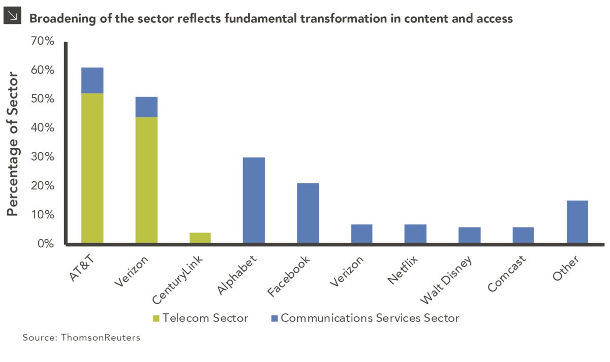
On September 21, 2018, the Telecommunications Services sector, the smallest sector at a 2% weight in the S&P 500 will quintuple in size to become the fourth largest sector in the index at the expense of the Information Technology and Consumer Discretionary sectors. This change is much larger than GICS’s creation of the Real Estate sector in 2016, which affected approximately 3% of the index’s market cap. Sleepy firms like AT&T, Verizon and CenturyLink will be grouped in the same sector as Alphabet, Facebook, and Netflix, just to name a few. Most notably, a sector classified as 100% value will be primarily growth-oriented.
The composition change is shown in the above chart; the formerly dominant names of AT&T, Verizon, and CenturyLink of the Telecom sector (shown in green) will now occupy a much smaller percentage of the new Communications Services sector, as shown by the considerably smaller blue boxes in the graph.
Luckily, most investment managers select stocks based on their investment merits and not their GICS sector classification. An investment manager that owns Alphabet (Google), which is currently classified as an Information Technology stock, on September 21st will continue to hold it on September 22nd. Much like the creation of the Real Estate sector in 2016, there is no action needed on the part of investors. We will continue to monitor new developments as S&P and MSCI finalize the change over the coming months.
The opinions expressed herein are those of Marquette Associates, Inc. (“Marquette”), and are subject to change without notice. This material is not financial advice or an offer to purchase or sell any product. Marquette reserves the right to modify its current investment strategies and techniques based on changing market dynamics or client needs.